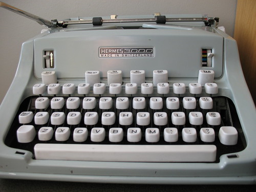
hermes 3000 epoca font
I do have a 3000 with that typeface, but it's suffering from lighter top-halves of letters, which I think indicates that the platen diameter has shrunk narrower than the curvature of the slug faces.
Anyhow, someone is interested in it, and maybe you want to make a computer font of it? If so, have at it. I've uploaded a scan of the characters from my machine into my Google Drive which you should feel free to fontify or ogle or pity, persons-who-are-finding-the-blog.
Typospherians: if anyone has tips for getting better letter impressions, I'm open to ideas. These were typed by running about five sheets of paper through the machine at once -- there's little improvement over past examples of the machine in use. I know about recovering the platen, and that may ultimately need to happen when budget allows, and I'm willing to stare into the madness that is the Hermes line-spacing mechanism.
Prepared with the help of my otherwise-awesome 1958 Hermes 3000


Very nice typeface.
ReplyDeleteI don't think the platen could have shrunk enough to affect the appearance of the letters; I think the problem is that you need to adjust the vertical alignment so that both lowercase and uppercase letters are striking a hair lower.
Epoca is one of my favorites.
ReplyDeleteI agree with Richard. The 3000s have adjustment screws to align the platen. I think Adwoa had a similar problem with one of her 3000 machines.
Cover the platen in Saran Wrap!
ReplyDeleteVertical alignment: sounds promising. I think I've fiddled with the shift range on this machine, but that's obviously not the solution. Once we get post-nano, I'll have to shell this again and see if I can find an adjustment for that.
ReplyDeleteAlso: I need to start leaving notes in the cases about what's wrong with these typers. Too many injuries, not enough brain cells.