▼
Tuesday, June 25, 2013
Monday, June 24, 2013
The Boundless Optimism of Craigslist
"Original finish, all parts, needs new ribbon - $50" |
Cobwebs no charge, "C" and "E" keys extra.
"Some paint on the keys, still in great condition - $40" |
You can tell the tide is turning because these are both sub $100 typers now. Tough economic times!
Sunday, June 23, 2013
Typewriter Day 2013
Friday, June 14, 2013
Break(ing) Non-News
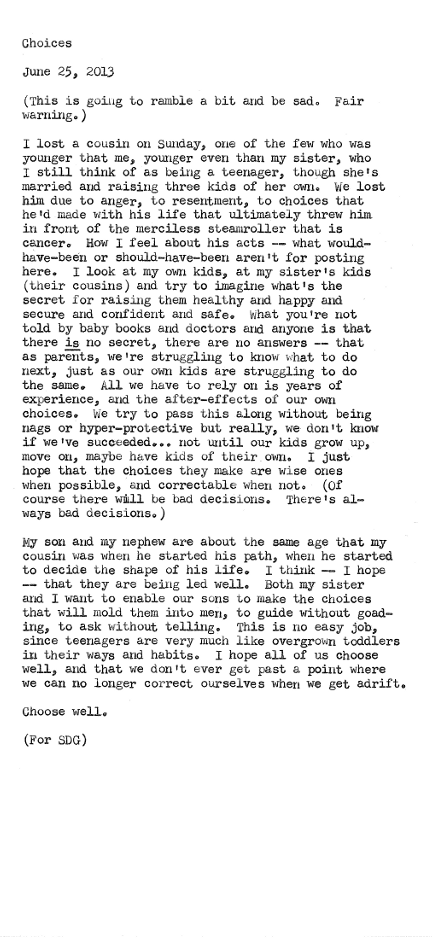
I'm nearing the end of vacation, slowly shrugging off a self-imposed digital hiatus to see if there's any work-related drama awaiting my return on Monday. We had a too-brief visit with family who report that my 11-year-old niece has adopted a manual typewriter for her memoirs: one can never start too early. I'm staying up too late reading, sleeping in too much, and may turn into an actual slug for want of physical activity. It's fantastic.
Today I took my teenage son out for his first driving lesson, making the obligatory slow circuits around an empty parking lot. It's the route preferred by generations of nervous fathers suddenly realizing that their first child is eye-level and still growing, and that we're far closer to college than crayons. In a tiny, proud way, my heart is breaking.
Happy Father's Day to the dads out there in the Typosphere, new, old, and upcoming. I'll be recharged in a couple more days, but first, I feel a nap calling me from underneath a good book.
Monday, June 3, 2013
Patience
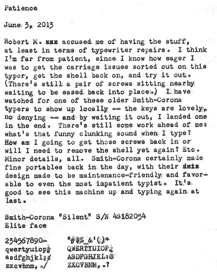
Inaugural typecasts are both wonderful and terrible: wonderful in the sense that you get a chance to show off a bit, and terrible in that you're paying more attention to the handling of the machine than the placement of words or the thoughts on the page.
Also, whoever designed the numerals for this (standard?) typeface clearly had a free spirit. Look at that "5"!
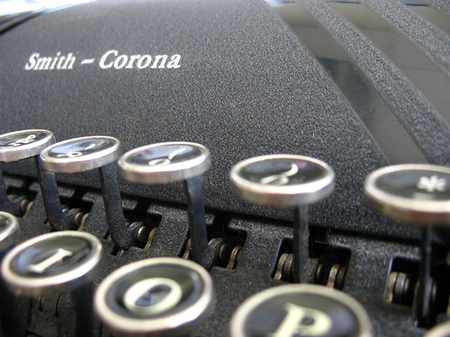
Typed on a 1948 Smith-Corona Silent