▼
Thursday, March 20, 2014
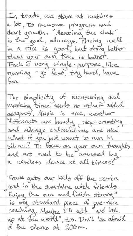
Silent Running
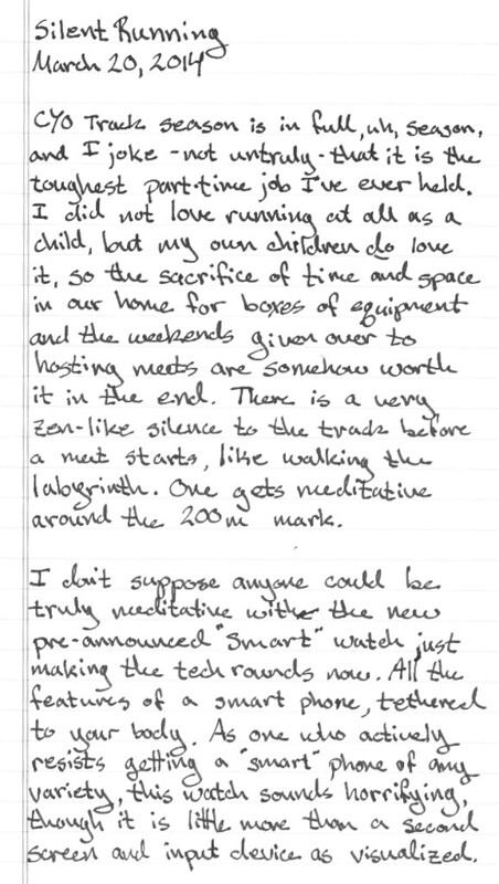
Scribbled with a Pilot Knight fountain pen, kitted out with an Italic nib liberated from the squiddy Pilot Plumix. This took a grouchier turn than I intended, but it is true that I spend about 20-25 hours per week making my wife a track widow, the poor thing.
Our meets are pretty low tech, doing all our registration on paper, starting with black-powder blanks, and recording times with paper tape and numbered popsicle sticks. At the high school level, they are far fancier (and bigger-budget) with electronic shoe tags, video cameras to record finishes and the like. There's certainly a place for higher technology, and maybe some day we'll sign in children all marked with QR codes and hand scanners. They're all facilitating technologies, though -- there's a need they are filling. I'm still unclear on the need for the second screen strapped to my wrist, determining if I'm dancing or not, and offering to look up the song for me online.
Monday, March 10, 2014
Paperlympics: Qualifying Round Results
Buried somewhere in that silly post featuring toy rhinos and brass 'roos was the question: is a yellow Rhodia pad "toothier" than a white pad, though they are -- in theory -- the same paper?
My own scribble testing results in an unequivocal yes. The paper is noticeably different, using the various writing instruments shown above, plus a few others I tossed into the mix after the initial results. And to tell you the truth, even knowing what to expect, I was surprised that I could detect the difference so easily.
All the pencils were far quieter on the white pad, and noticeably louder on the yellow. This was especially pronounced in the mechanical pencil, which maintains a very narrow tip, but even that big chunky Moleskine pencil was markedly different. The yellow paper absolutely gives more feedback as you're writing on it. The white pad is nearly ninja-silent with a pencil.
Almost all of the pens I tried with a "fine" or "medium" nib exhibited the same properties: more feedback, a touch more noise. My red Sheaffer school pen is notoriously scratchy on cheap paper, and I tend to use it only on nicer paper as a result. It magnified the difference in surfaces between the two pads, though it wasn't unpleasant on either. Most medium-nib pens were noticeable. Only when I moved up to the italic-nibbed Pilot did the differences go away. Perhaps the wideness of the nib skates over the tiny surface differences, or I'm just not a good enough penman to know the difference.
Given this result, I brought out a couple more extreme examples: a super-fine rollerball pen, a couple of colored pencils, a cheap ballpoint, and a broad calligraphy nib in a plastic Sheaffer, cousin to the school pen. All except the calligraphy pen were different. What's more, the Calligraphy pen revealed tiny amounts of feathering on the yellow pad, and even a few pinpoints of ink bleeding through. Were I a calligrapher and not just some slob, the yellow paper would be demoted to the "practice only" pile.
The last thing I've tested out is front-versus-back. Paper has a finishing step when it's made, and I remember from a few mis-spent summers as an all-around-office-boy that there's a "right" and a "wrong" side to paper. Wikipedia has a piece on paper sizing if you want to know more -- sizing as in finishing, not on paper sizes, which is a different article. The final round of tests was comparing writing on the front and back. I'm less sure about this test: sometimes I'd swear that the back of the white paper was rougher than the front of the yellow, at other times there were about the same. If there is a quality difference between front and back, it's a tough one to discern.
Three final observations to make, and then scans of the front-side tests are after the break.
First, the white paper is cooler to the touch, as in temperature-cool, not leather-jacket-and-Harley cool. I'm positioned underneath an air vent which can't help, but by resting a hand on each, the yellow paper warms up faster. Color difference? Surface difference? The magic of thermodynamics is at play, anyhow. There's a thesis in there for a physics student, perhaps.
Second, the yellow paper just seems thinner. I don't have any reason to doubt the stated weight on the cover, and have no way to verify it beyond just a shake test, and noticing things like ink bleed-through and show-through. For an extreme test, I have a disposable fountain pen filled from one of those inkjet printer refill kits which practically pours ink down the nib. The resulting letters show through on the yellow, less so on the white, though neither are very happy with trying to hold that much ink. I didn't say it was a fair test.
Third, and finally: although the yellow may have come out "worse" here, it's the better of the two in certain circumstances. If I were a student and using pencils on a regular basis, the white paper is quieter and smoother, but the yellow is surely easy on the eyes after a weekend binge or an unfortunate move to Daylight Savings (or both.) Some of the pens find the white paper almost too smooth. The Pelikan, for instance, always wants to skip on the white, but is fine on the yellow where the surface of the paper and the capillary action of the nib mumble mumble mumble handwave it just worked better, OK? This is not an unusual circumstance for pen owners, as we're always looking forexcuses to buy more supplies find the perfect combination of pen/paper/ink. It's the El Dorado of the ink addict.
So, there you go, Exaclair -- a highly unscientific and unfocused confirmation of your own customer feedback.
When my daughter and I get the chance, we're going to kick off our own more involved tests at home, comparing to other brands of yellow and white writing pads. Stay tuned for that, and a return to rhino-and-roo, the paper pals.
My own scribble testing results in an unequivocal yes. The paper is noticeably different, using the various writing instruments shown above, plus a few others I tossed into the mix after the initial results. And to tell you the truth, even knowing what to expect, I was surprised that I could detect the difference so easily.
All the pencils were far quieter on the white pad, and noticeably louder on the yellow. This was especially pronounced in the mechanical pencil, which maintains a very narrow tip, but even that big chunky Moleskine pencil was markedly different. The yellow paper absolutely gives more feedback as you're writing on it. The white pad is nearly ninja-silent with a pencil.
Almost all of the pens I tried with a "fine" or "medium" nib exhibited the same properties: more feedback, a touch more noise. My red Sheaffer school pen is notoriously scratchy on cheap paper, and I tend to use it only on nicer paper as a result. It magnified the difference in surfaces between the two pads, though it wasn't unpleasant on either. Most medium-nib pens were noticeable. Only when I moved up to the italic-nibbed Pilot did the differences go away. Perhaps the wideness of the nib skates over the tiny surface differences, or I'm just not a good enough penman to know the difference.
Given this result, I brought out a couple more extreme examples: a super-fine rollerball pen, a couple of colored pencils, a cheap ballpoint, and a broad calligraphy nib in a plastic Sheaffer, cousin to the school pen. All except the calligraphy pen were different. What's more, the Calligraphy pen revealed tiny amounts of feathering on the yellow pad, and even a few pinpoints of ink bleeding through. Were I a calligrapher and not just some slob, the yellow paper would be demoted to the "practice only" pile.
The last thing I've tested out is front-versus-back. Paper has a finishing step when it's made, and I remember from a few mis-spent summers as an all-around-office-boy that there's a "right" and a "wrong" side to paper. Wikipedia has a piece on paper sizing if you want to know more -- sizing as in finishing, not on paper sizes, which is a different article. The final round of tests was comparing writing on the front and back. I'm less sure about this test: sometimes I'd swear that the back of the white paper was rougher than the front of the yellow, at other times there were about the same. If there is a quality difference between front and back, it's a tough one to discern.
Three final observations to make, and then scans of the front-side tests are after the break.
First, the white paper is cooler to the touch, as in temperature-cool, not leather-jacket-and-Harley cool. I'm positioned underneath an air vent which can't help, but by resting a hand on each, the yellow paper warms up faster. Color difference? Surface difference? The magic of thermodynamics is at play, anyhow. There's a thesis in there for a physics student, perhaps.
Second, the yellow paper just seems thinner. I don't have any reason to doubt the stated weight on the cover, and have no way to verify it beyond just a shake test, and noticing things like ink bleed-through and show-through. For an extreme test, I have a disposable fountain pen filled from one of those inkjet printer refill kits which practically pours ink down the nib. The resulting letters show through on the yellow, less so on the white, though neither are very happy with trying to hold that much ink. I didn't say it was a fair test.
Third, and finally: although the yellow may have come out "worse" here, it's the better of the two in certain circumstances. If I were a student and using pencils on a regular basis, the white paper is quieter and smoother, but the yellow is surely easy on the eyes after a weekend binge or an unfortunate move to Daylight Savings (or both.) Some of the pens find the white paper almost too smooth. The Pelikan, for instance, always wants to skip on the white, but is fine on the yellow where the surface of the paper and the capillary action of the nib mumble mumble mumble handwave it just worked better, OK? This is not an unusual circumstance for pen owners, as we're always looking for
So, there you go, Exaclair -- a highly unscientific and unfocused confirmation of your own customer feedback.
When my daughter and I get the chance, we're going to kick off our own more involved tests at home, comparing to other brands of yellow and white writing pads. Stay tuned for that, and a return to rhino-and-roo, the paper pals.
Wednesday, March 5, 2014
Paperlympics: Opening Ceremonies
For best effect, play while reading...
When I saw the post last month on Rhodia Drive about the chance to test-drive a pair of their writing pads -- one with yellow, one with white paper -- I was perhaps a tiny bit interested. I already have a professed love for the bright orange brand, having been turned on to its magical ink-friendly properties by the enablers at Fountain Pen Network. And I know the generosity of their marketing department with samples, so of course I threw the Clickthing hat in the ring, and then waited (im)patiently for a confirmation email, and ultimately a package from Exaclair. The package arrived yesterday, and I am not disappoint, as the kids say.[1]
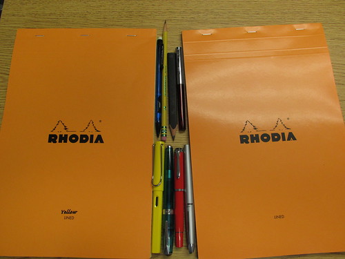
Two A4 tablets, 80 pages each... oooh, be still, my paper-lovin' heart
You can go back and read the original post, but the upshot of this trial is: the yellow paper is "toothier" than the white. It's already been confirmed by Stephanie at Rhodia Drive, but this offer is to try it out with other writing instruments, and then report back to Exaclair/Rhodia HQ. As I love me a paper test, I of course set to gathering the competitors in what I'm modestly calling:
The Paperlympic Games of 2014
I agreed to test them out with pens, and test them I shall. And since I'm curious, I also want to try them out with whatever pencils I have here or could scrounge from the office supply room at work. You can see them in their parade formation as they entered the stadium, but we caught them in a more relaxed moment back in the athlete dormitories.
The Athletes
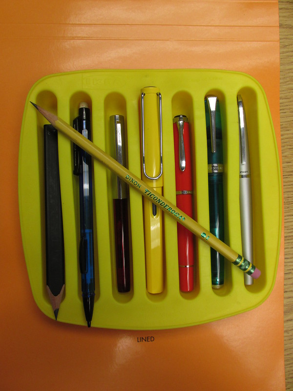
The competitors, in a moment of repose
Like Sochi, there are some small issues of comfort that need to be sorted out, but generally everyone is happy. From left to right, the competitors are:
- Representing the Czech Republic: the Moleskine brand 2B hipster pencil
- Representing probably China: the Sanford Clickster 0.5mm mechanical pencil
- Laying crosswise, another China entrant: the Dixon Ticonderoga 2HB woodcase pencil
- From the United States of America, a late-80s vintage Sheaffer school pen, F nib with period Skrip jet black ink
- Representing Germany, the Lamy Safari, F nib with Lamy blue ink
- Also from Germany, a Pelikan m205, M nib with Waterman Serenity Blue ink from France
- From, um, Levengerland, a True Writer demonstrator, M nib with modern Sheaffer Skrip blue/black from Slovenia
- From Japan, a Pilot Knight with a M italic nib from a Plumix pen, inked with Pilot/Namiki blue/black
The Field of Competition
For the qualifying round, athletes will go head-to-head on these carefully-manicured surfaces.
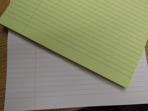
All markings follow IPC guidelines
On the surface -- ha! -- this paper appears to be the same. Both are 80g/m2 "High Grade Vellum Paper," both lined with margins. Both feature heavy foldover covers and a stiffish piece of cardboard affixed in the back to provide support for writing. Both are staple-bound with a fine perforation along the top edge to enable easy removal. Both feature Rhodia's purple lines with a red margin, though the lines appear darker on the yellow paper, and a bit brown, likely thanks to the color contrast.
Identical but for paper color, yes? Well, that's what we're here to find out.
For more, let's go over to the field where our on-the-scene reporters are standing by with some insightful color commentary.
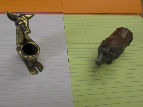
This does not bode well
Roo: Too right! It's as pale as a wallaby's bumhole! [2] Crikey! Uluru!
Rhino: O HAI I SEE YELLO
...
Annnnnnnnnd with that, we'll go back to the studio.
The Judging
This one's a little tough, since I'm coming in with a bias; I know that I'm expecting the yellow pad to be a little scratchier with a pencil, so I'm mainly looking for other differences in feel between the two surfaces with the different instruments. It'll be as scientific and impartial as a blog post can be -- that is to say, it'll be chock full of baseless opinions [3] in which accidental facts may unintentionally appear.
I'm going to use each of these for the next week or so, and write up my opinions-carefully-phrased-as-facts, share them with Exaclair, and you lucky readers. Both of you.
But it doesn't stop there! In the interest of true fairness, and to explore the whole notion of blind studies and the scientific method, there is a second, longer portion to the Paperlympics. Just as the real Olympic games feature countless variants on "two people ice skating together" [4] so, too, does the full-blown Paperlympics finals have an excruciating number of nearly-identical events.
I've prepared a number of samples of paper, in which the Rhodia is secretly mixed, for my daughter and I to test out at home. In this way, we'll be putting it not only through the paces of the paper-obsessed office worker, but also the rigors of the typical tweenage homeschooler. And we'll be turning it into something of a science lesson, too, by checking properties, assigning scores, and in the end, looking at the samples under a microscope (because science.) She doesn't know which sample is which, so I'm hoping to eliminate at least a shade of bias. I will attempt to refrain from comments like "this next one is TOTALLY AWESOME AND FREE so score it accordingly, won't you?"
But first, we need to get through the early rounds of this fine, traditional, just-made-it-up-last-week sport. If you're anything like me, you just want to skip ahead to the finals and see if there's any spectacular crashes. Be patient! I'm sure with me at the helm, disaster cannot be too far behind.
So,
[1] No kids actually say this.
[2] No Australians actually say this.
[3] Opinions, it is said, are like bumholes. Everyone has one, and you should keep yours private. Especially if you're a wallaby.
[4] All of which are shown on evening TV at the expense of any other events, not that I'm still bitter, NBC-I'm-looking-at-you. Thank goodness for DVRs and/or perfectly legal streaming.