
Digital experimentation is a good way to get your feet wet. Try shooting something with your digital camera of choice, then open it up in an image editor and convert it to a greyscale photo. Which of these pictures do you like better in color, and which do you prefer in black and white? My thoughts follow the thumbnails...
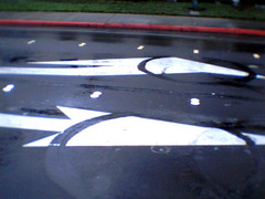
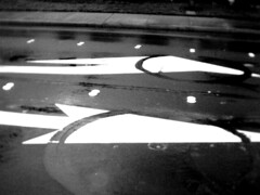
1) Arrows
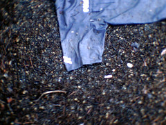
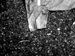
2) Wet Shirt
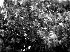
3) Leaves

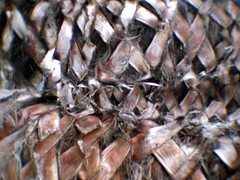
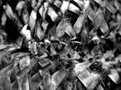
4) Palms
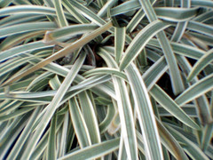
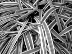
5) Landscaping
My favorites:
- I prefer the color version of the street arrows. The red curb is completely lost in the black and white version, and I like the way the red grabs at my eye in the color shot.
- It's close for the shirt photo. The color shot emphasizes the distortion effects of the cheap lens more, I think, but I like the texture of the black and white photo. I'm slightly in the B&W camp on this one.
- For the leaves, black and white is the clear winner to me here. The washed-out colors muddy the photo in my opinion. Black and white is great for pointing out edge detail, in part because our eyes are so sensitive to shades and levels of light. It's not just that the color information is gone from the second picture, but other information is subtly boosted.
- Black and white for sure. Although it's one of my favorite subjects -- a cluster of palm trees -- I think the black and white is far more dreamlike and makes you work harder to guess what you're seeing. I like pictures that make me wonder a little. The original was shot in portrait orientation which is more obivous if you live around palm trees and their unmistakable bark. Showing it in landscape adds more "what is that" to the final photo.
- This is a cheat, since I deliberately chose this to illustrate how black and white can change a scene. The yellowing fronds in the color picture distract me, and make my eye hop around looking at them, instead of the pile o' stripes that I (the photographer) was hoping for.
3 comments:
I like the b&w photo of the street arrows. It looks like motorcycle doughnuts? I'd say? I have wanted to screw around with some b&w photos and might have to soon. I have an old version of PS for mac but I think it will do just fine. Keep em coming!
This was a nice comparison. I agree with your choices, although with the shirt image I like the subtle color speckles along the periphery of the image but think the blue shirt itself works better in monochrome. Reshoot with a gray shirt? Just kidding.
I'm using SilkyPix software to develop the RAW files from my G1. I first desaturate the image, then tweak the multiple controls to get as nice of a B/W image as possible, then add the color back in, do white balance and noise reduction, then develop to TIFF. For B/W output I'll import the TIFF to PS to do channel mixer.
I come from a B/W darkroom background, so monochrome is my first choice; but the colors are so good with the G1 that I've rediscovered color; although as your comparison shows not every image works in color.
I must express a preference for the B&W's. They just appear to be so much more clear without different hues getting in the way. I did, however, like the bright red curb in the first one. Red accents always remind me of an Olivetti.
Post a Comment