Friday, January 27, 2012

A Tale of Two Hangers

So, I hate wire clothes hangers. Not in the extreme sense, but I still dislike them because they are disastrous to my shirts. I'm a pretty big guy with broad shoulders, and using cheapo hangers on my shirts makes them pucker up into most-unmanly "shoulder nipples" of fabric. (And hello to all those random Googlers who were looking for something else when they typed "shoulder nipples" into the search box. Sorry to disappoint you. Also: ick.) We've been able to banish all but a few of these from our home, leaving a couple for kid's art projects or for snagging hand towels that fall behind the dryer.

Tubular plastic hangers are only slightly better in that they don't crumple under the weight of normal adult clothing, but they are used mainly for hanging up damp swimsuits in the shower in the summer. Slowly, over the years, I've been replacing both of these organizational abominations with wooden hangers. They're more solid, they are shaped like clothes are actually shaped, and keep my shirts neat. So of course I was delighted when my local thrift store put out a big bin of FREE HANGER'S (sic) TAKE ALL YOU WANT

Oh yes. Yes I will.

So I loaded up. A bunch from Ikea, to join the bunches from Ikea already holding up our coats at home. A few more that were in good shape and looked pretty sturdy. And then, down at the bottom of the bin, I found these two fellows.


Wooden hanger from Van Orman Hotels in Indiana and Illinois

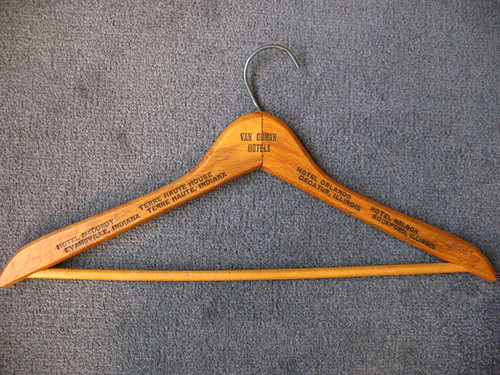
This one caught my eye first, because it has printing stamped into both the front and back. This is the front, pictured above, and here's a detail from the back:

Detail from wooden hanger from Van Orman Hotels in Indiana and Illinois

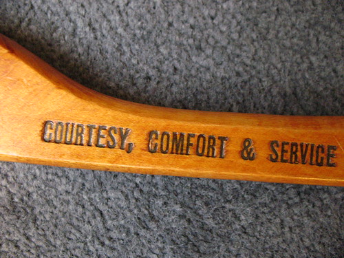
The full statement on the back is "Four Modern Hotels of Courtesy, Comfort & Service." And when this hanger was in regular use, I'm sure that was the case. Check out the modernity!

20120127 postcard
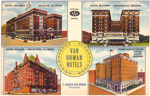
Image from Postcard Ranch

I have no idea how this (pilfered?) hanger from a Midwestern, mid-century hotel quartet wound up in Northern California, though I know an estate sale just unloaded a number of items in this shop, so it's likely that the former owner has passed on, leaving this memento of a comfortable stay in one of these fine AAA hotels. What caught my eye the most, though, was that I was born in the selfsame city as one of these four (information thieves, take note.) It appears to still live on today as apartments.

The other hanger was underneath the first: a much thinner, cheaper, giveaway-quality example.

Vintage Coast Tailors and Cleaners Hanger

What made this interesting to me is that I know it's from San Francisco (Vicente St.) and it's relatively old, given the phone number "MO 5662" -- predating the three-digit dialing prefix. Sure enough, Google found a scan of a 1938 phone book with this business and their number, practically dwarfed on a page full of cleaners and a competitor's massive advertisement.

Section from a 1938 San Francisco phonebook
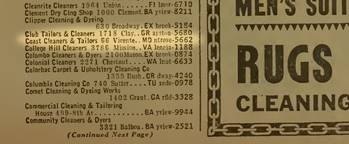
Source PDF document found here

It's not easy to tell what's there now: redevelopment happened, and Google Maps' best guess is that the cleaners address is now home to either a Starbucks or a Chase Bank.


View Larger Map

I have no way to know if these two items came from the same closet, if their former owner had, at one point in his life, made that same strange journey that I have, blowing West like a seed on a contrary jet stream. I know there's no significance to me finding them together, but it made me think of this story, made me do a little searching about two places that I have temporarily called home, and most importantly, saved me from the social shame of shoulder nipples.

Friday, January 20, 2012

Wide Load

20120120 typecast

Speaking of depreciation, the price I paid for this (in 2010 dollars) equates to $0.93 in 1967 dollars, roughly the price of a pound of ground coffee in the supermarket. This machine stayed local, as you can see from the owner's notes. Interestingly, our dining room table and living room furniture in our current home came from the same store, about 30 years later, just a handful of years before "Monkey Ward" disappeared entirely.

Teaser photo: test-typed on a Montgomery Ward Signature 513 (made by Brother)
Beige and Chrome

Wednesday, January 11, 2012

Spoilers

20120111 typecast

Goodreads seems like a fairly decent way to document my reading (and monetize it, no doubt). I'm just starting to use it. No promises that it will keep me from reading trash, though.

Typed on a Hermes 3000
Hermes 3000, c. 1968

Monday, January 9, 2012

The Quest for Cover Art: Wisdom of the Bowker

Rob Bowker passed along a very helpful email to me, and rather than butcher it by trying to recap, I'm going to include a slightly edited version here:

BEHOLD

Here are some suggestions about what to include in a brief to an illustrator:
  • Size, especially height to width ratio
  • Layout: do you want an illustration to bleed off the edges (no margin), or just a spot illustration?
  • Colour: a black line drawing with a spot colour will be less expensive than a full colour 
  • Text area: to produce an all-over cover, the illustrator will need to know the precise positioning of the all the type - unless they are including the type as well.
  • If you are selling digital editions, the image will need to work as a smallish thumbnail.
  • Budget. An illustrator may ask for 50% down, 50% on completion. A full blown painted illustration may take a day or two, so could run to $1000 plus. You need to decide how much you can afford to spend. Remember, every time you change your mind, the meter keeps running. See above.
  • Show and tell: grab an example of something that tickles your fancy and say "like this".
Remember, there are a thousand different ways to illustrate your book - but you can only choose one. It will be a compromise. Also, it can be a bit of a roller-coaster ride and you may not end up where you thought you wanted to go - but it could still end in a perfectly good place if you treat it as a collaboration more than a simply transactional commission.

Concise and helpful, yes? I hope Rob doesn't mind me co-opting his email for what is basically a free post. I'll be sure to compensate him in whatever imaginary currency bloggers use. (I'll send you some of the Russian spammers that drop links in my comments, Rob.)

For a short while in my professional wanderings, I did happen to work for a spinoff of a printing company, so although I may not know the exact terminology, I do understand "gutter" and "bleed" and at least some of the issues of print... circa 1995 or so. Of course, the world has also changed dramatically since 1995. To wit: the company that I was working for was going to ride the Next Big Technical wave -- interactive CD-ROMs. It just so happened that I'd done some HTML, and then suddenly we found ourselves making web sites instead, with the culmination of me shaking hands with and receiving a signed mouse pad from Fabio. (Oh, the dot-com years were strange ones indeed, my friends.)

For those inclined to go the DIY route, there are certainly tools out there to simplify the process. NaNoWriMo folks get a discount on getting a proof copy printed up by CreateSpace (aka Amazon), which I've done with a much earlier draft of the book in question:


Time to Edit, or, the Proof is in the Pruning

It was done in a hurry, with a stock layout and photo on the site, but like Mr. Speegle, I have to admit to the electric thrill of holding something bound with my name on the cover. But now there's the considerations of making only what amounts to a single image, possible rendered in gray-scale on an e-ink screen as well as a full-color tablet. When the bookshelf is virtual and the "book" is palm-sized, how does the illustrator's craft adapt? I've even toyed with the idea of per-chapter illustrations a la a certain other fantasy title (cough Harry Potter cough) but then realized that honestly, the whole layout of the book is really up in the air, as you can't depend on the device. You certainly don't want any additional art to distract from the reading experience.

Frankly, the whole thing takes me back to that job in the mid-90's, trying to reduce .GIF sizes and design to accommodate 640x480 screen resolutions and to make pages AOL-friendly. I should straighten up in case Fabio comes wandering by.

Thursday, January 5, 2012

Illustrator Redux

Once again, I get to show off how little I actually know. A few things I've learned since my initial call for an illutrator:

  1. There are a lot of talented people out there
  2. I should probably not ask for help over vacation, since I'm offline most of the time, and those same talented people now probably think I'm rude/dead
  3. I'm actually only one of those things
  4. It's probably a good idea to nail down the cover illustration while your draft is being read and revised, and not after, so you don't have this nagging sense that the process has come to a crashing halt, when in fact it's just taking The Right Amount of Time
  5. There is no number 5
  6. I know nothing about how to spec illustrations, or how this process is "supposed" to work
  7. "Illustration" is a very broad term, which appears to mean "anything other than a photograph"
To everyone that's contacted me: I'm sorry I have not replied, please see point #2, above. One person is taking a swing at the cover, but as per #6, I don't know if it's standard/polite/acceptable to also ask other people to do the same, at the same time. That feels a bit unfair to me, and considering that the stakes are so low, I don't want to get anyone's hopes up. But clearly there's artsy talent out there, waiting to be tapped.

So, here's my promise to all the illustrators that I have been rude/dead to: I'm re-reading this year's NaNoWriMo draft, with the intent of digitizing the same and unleashing it on my unawares pre-readers. When that happens, I'll put out another call for a cover for that book, per #4. I can only do that, however, if I also learn what's expected of me. Illustrators, what do you need from an author?