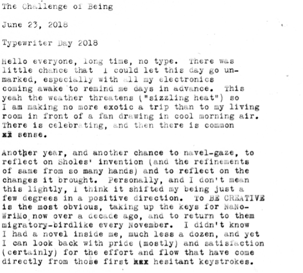
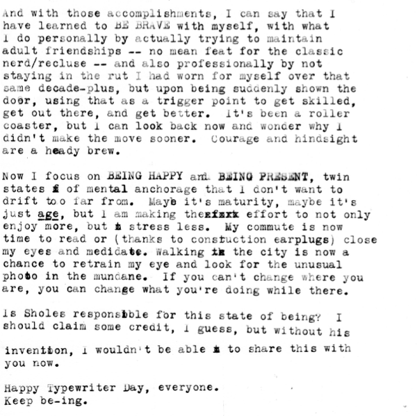
I think my "new" blogging methodology is to try to remember my password every 6-9 months or so, post, and then vanish into the fog again. The good Professor Polt has commented that social media looks like it's usurped straight-up blogging, and I'm certainly guilty of that, though I've also given myself a hard diet from it. Except for Instagram (follow, like & share!) I have all but dropped off the Social Media train -- or is it trainwreck? -- and I attribute that to making me feel happier, too. But I'm still here, cyber-stalking as one does on teh Cyberz.
I will say that despite there being fewer voices in the blog world, the typewriter community at large feels even larger and livelier than ever. The Yahoo groups are still (still!) hanging on, and there's no shortage of restorers, resellers, and admirers out there. It's heartening, because I feel like we've adapted as a community, even as the winds of what's "cool" have changed. For myself, I do claim a much longer personal history with the image than with the written word. I truly didn't get "in" to writing until joining up with the Typewriter Brigade all those (Duffy) Moons ago. So my gradual upgrading of a better phone and camera, and obsessively snapping pictures of office buildings and random architectural details is nothing new. It's just easier to share: practically frictionless, like social media was designed to be.
One massive disadvantage to willfully dropping off social media -- and perpetually being bad at blog upkeep -- is that I cannot pester people remotely and incessantly for personal gain. If you're still in the NaNoWriMo Typewriter Brigade, you may know that I attempted some Bravery last year and asked people for donations and dressed up and carried a typewriter to San Francisco on a train and talked with strangers and had a great time. I count all of these as Major Achievements, especially the dressing-up part. And I'm doing it again, or am hoping to:
I'm fundraising to attend the NaNoWriMo Night of Writing Dangerously, held in San Francisco. It took me a decade of self-convincing to believe that I could do it, and now I'm trying to stamp out that regret by going back. Last year I took a travel 'writer, and my hands and arms paid dearly. This year, we type in style -- I'm thinking Olympia SM9 -- and damn the consequences and possible hernia.
But I need your help...
I have a fundraising page set up, and all proceeds go to the fine folks at NaNoWriMo.org for their educational programs and outreach. I wrote more about it on the page, it's goofy and pleading, just like me in real life. If you're able to contribute even a small amount, I and the NaNo folks, would be most grateful. U.S. contributions are tax-deductible, and if you're a lapsed Wrimo, this is a good way to help out an organization and promote the Typosphere. I was the only typewriter-bearer in the ballroom last year, and I made a welcome racket (seriously: so many people complemented me on the industrious noise.)
Thank you in advance for your support, and I hope you all have a delightful Typewriter Day.