Step 1: Sketching
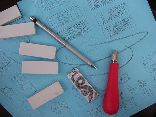
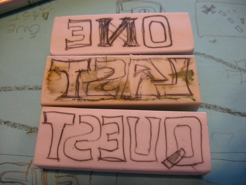
These erasers are pretty small, around 2 1/2 inches on the long side, and about 3/4 of an inch across the short edge. I say "around" and "about" since these came from the dollar store, and are not exactly manufactured to precision specs. The small size is an asset, though, since it forced me to think about what I could accomplish in a small space with my limited art abilities.
I trace out a bunch of rectangles on paper from the erasers, and then spent some time fiddling around with the letters shapes. Since this is a cover for an e-book, I wanted to make sure whatever I made was bold and would show up well when reduced to a thumbnail size. You can see my doodles on the blue paper behind these erasers. I was still trying to figure out what to do with the word "LAST" here, since I didn't like the big gap between the "L" and the "A" but there's not a lot of room to tinker around.
Step 2: Transfer
To transfer the image, I placed the blank eraser next to the drawing and then copied a mirror image over. This process was fraught with peril, since my brain kept helpfully "fixing" things as a drew: note the remnants of the "N" in the word "ONE" and the fact that "LAST" was actually erased because I'd done the "L" and "S" the wrong-way around. Voluntary dyslexia is difficult, people.
Only later in the day did I realize that you could press a blank eraser against a heavy pencil drawing and enough of the graphite would transfer over to give me a reference point to recreate the drawings. Duh. (LESSON #1)
Step 3: Outline Cut
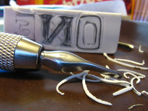
With outline in place, cut away! I used a Speedball Lino Set #1 that I found in a local art store (not Blick, sadly) but these erasers are so soft that you could use anything sharp enough and controllable. If you happen to have a Speedball drawing pen holder, these blades fit inside that, too, which is handy.
Except for the knife blade, all the lino tools have a U-shaped edge, in various depths and widths. This is supposedly the best way to cut stamps, versus cutting directly perpendicular to the surface, as it gives the stamp surface more strength. I stuck almost exclusively to the smallest size since these erasers are so small. And I found it easier to turn the eraser under the tool to make corners, instead of trying to hold the eraser steady and drive the cutter around. This may be horrible technique, but it worked for me. (LESSON #2)
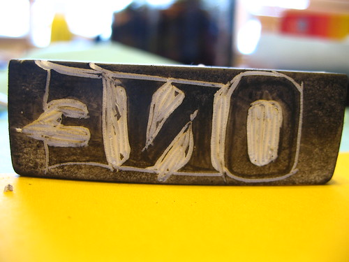
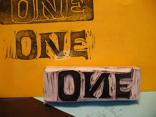
Step 4: First Impression
With all the outline carved out, all the handy pencil marks are theoretically gone from the surface of the eraser, and there's not enough contrast to see what's going on, at least for my middle-aged eyes. Time to break out the ink pad! Just a quick stamp to make sure everything looks OK, proportions are good, I didn't flip the "N" backwards again, etc..
Step 5: Fiddly Carving
First impression passes muster, so using the same tool ("Liner #1") I carved out the narrow spaces inside and between the letters. The leftover ink is a huge help here, since you can see what's left to do. I deliberately wanted to keep the rough-carved look for the art, so I left a lot of the excess in place. I planned to scan these and remove any problems digitally, so better to have too much "extra" stuff than not enough.
Step 6: Final Carve
With the fiddly stuff done, I swapped blades and cut away all the rest of the excess. Now repeat steps 2-6 for the other two words, and then sketch up designs for the "icons" on the cover.
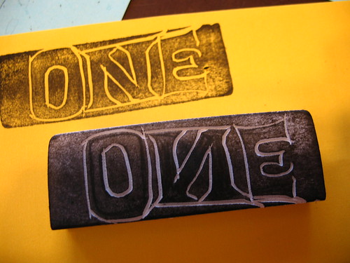
I did have trouble pinning down how I wanted the word "LAST" to look. The nice thing about using super-cheap media like dollar-store supplies is there's no real pain in tossing a bad design. Now I have an eraser I can give to my kids for schoolwork once I cut off the inky part.
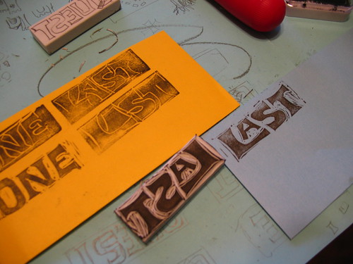
You can see the rejected outline impression here on the orange piece of paper, and then the stamp that became the final design, with the "A" nested snug.
Step 7: Layout and Scan, and Tweak, Tweak, Tweak
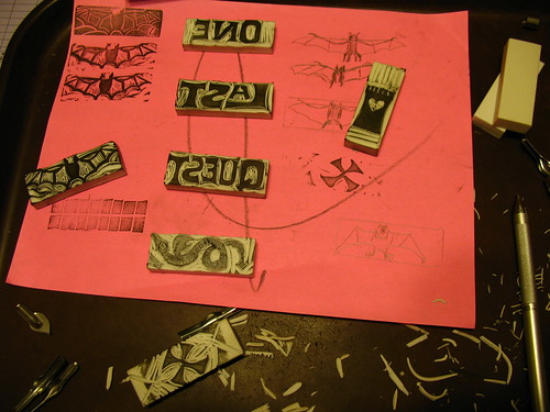
There were eight total stamps in the cover: the three words, the tower, bat, and dragon, the "X" and the source for the dotted-line path (seen just under the bat stamp above.) I did a few impressions of each stamp on a piece of plain white paper and scanned them, thinking that if I got a bad one, I could just magically copy over a good letter from another impression and drop it into place. Ha Ha! I was so naive. Here's a little tidbit I didn't think about: eraser stamps are very flexible, and they distort slightly when you press them into the page. In other words, the clean bat wings I got from impression #1 would not fit nicely over the smooth bat-body from impression #2, no matter how much I insisted that they should. Live and learn. (LESSON #3)
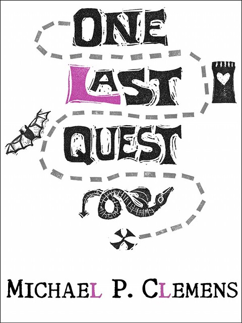
I brought the whole scan into Gimp and spent most of the day scooting them around a virtual page. I scaled up the words and digitally removed some of the extra print-marks and cutting goofs. The dotted-line path was made from digitally cutting up a quickie grid stamp that I made, and then laying each rectangle down individually. That felt like it took forever. I fudged the colors a bit, and with Richard Polt's permission, used his Royal Quiet Deluxe font for my name.
And the final result:
I'm so pleased with the way that this turned out that I'm considering adding to the collection and doing simple interior stamp illustrations at each chapter head. But then, I've been known to pledge projects here before...
In the meantime, if you are the keeper of an electronic reading device and about a latte's worth of spare change, you, too can marvel at how spiffy this cover art looks on the screen. Oh, and there's some funny words that accompany it, too, if you're into, you know, reading.
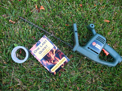
You can get a copy of One Last Quest from Smashwords in just about every digital format, or from Barnes & Noble or Amazon if you happen to have one of their readers. All editions are DRM-free, because I'm a tree-huggin' hippie at heart.