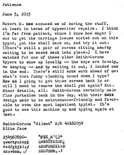
Inaugural typecasts are both wonderful and terrible: wonderful in the sense that you get a chance to show off a bit, and terrible in that you're paying more attention to the handling of the machine than the placement of words or the thoughts on the page.
Also, whoever designed the numerals for this (standard?) typeface clearly had a free spirit. Look at that "5"!
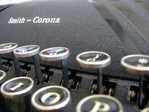
Typed on a 1948 Smith-Corona Silent


3 comments:
Looks good!
I think the numerals are where you can see the most individuality in standard typewriter typefaces.
very nice - I'm still not there with repairs yet.
I can think of worse things that having Robert Messenger accuse you of having "The Stuff". :D
BTW, beautiful Corona (:
Post a Comment