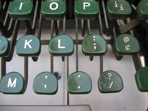
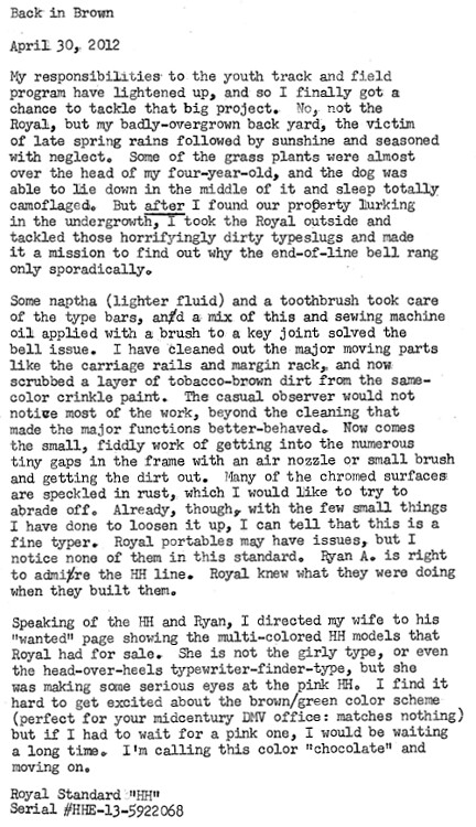
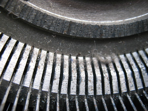
Some photos from during the cleaning and assessment process.
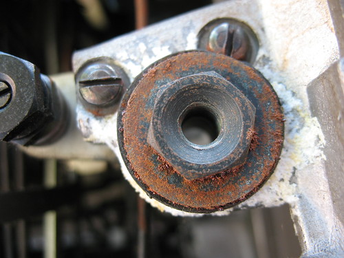
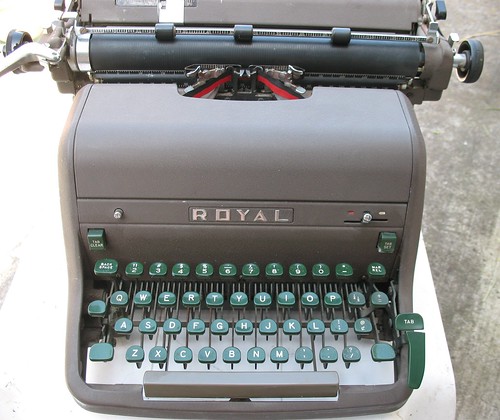
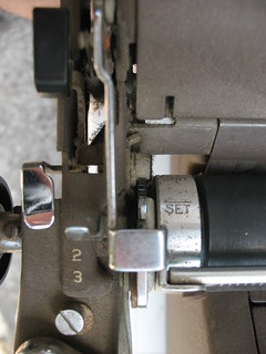
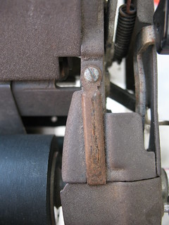
The overall condition of the machine is good: better than I remembered when I scouted it out in the store. It still has a lot of function left in it.
Thanks to the tab mechanism, the back panel of the HH is curved, which makes the machine wobble around when you balance it on its back. It's like a tortoise that's been cruelly inverted in its shell.
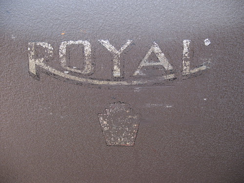
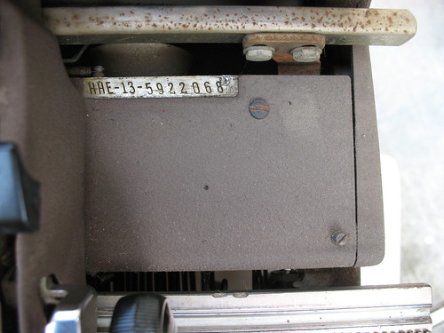
I wasn't paying close enough attention last time, as it turns out this is an elite type machine. Not my preferred size, but the face is clean and easy to read, especially now that the slugs have been cleaned out. None of the rustiness impedes the machine's functions.

7 comments:
A thing of beauty is a joy forever.
"Perfect for a midcentury DMV office" -- love it.
Mine is the same shade, but I try not to be snobby towards it. It is a fine typewriter, although I don't feel it's 100% as snappy as the KMM.
The dullest and finest typewriter to be had. Congrats!
Nice typewriter. A bit of oil rubbed into the rust and it may never be noticed again. That typewriter has a neat typeface.
Sometimes it is best not to look too close. Failing middleage eyesight can be such a blessing. But thankls for the translation - don't think I ever saw naptha for sale in the UK, but lighter fluid, yes. What's that about two great cultures divided by a common language? I never yet tried lighter fluid on my slugs but will be any day now.
Dare I suggest... painting said typewriter?
If pink is what you wish, and as those decals are already extensively damaged, I can't see the harm.
If I had my druthers, I'd take it in a blue metallic paint with fresh chrome, but I do like it the way it is. It's very earthy. Almost elfin, if it didn't weigh a crap-ton. I buy 'em to use 'em, after all. I don't care if they're Martha Stewart-ready or not. (But if I find a pink machine sometime, I now know I'll get a sympathetic eye on the home front.)
Post a Comment