Apologies for the grammar gaffes and typos (I do know when to use "its" and "it's", honest.) Can I say I was focused on the spacebar fix and not paying attention to what my fingers were typing? Yeah, let's go with that.
I don't really think about the type design, but you're right: the layout of the characters is very readable. It's no mean feat designing a mono-spaced font that doesn't look, well, like it came out of a typewriter! It's very readable.
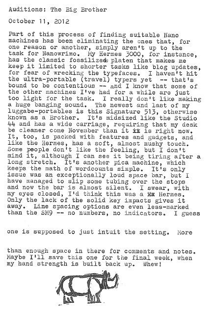
The rhino stamp is a handmade original. In fact, it even graced a postcard that got lost somewhere between here and there! It was about an escaped rhino, so I suppose the loss is appropriate.
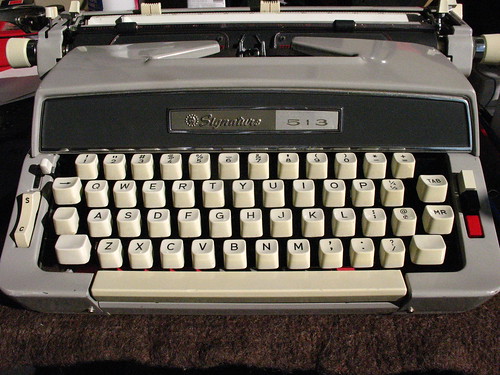
It's an unknown quantity, I guess. I'm actually pretty sweet on this machine, but it's most certainly a different touch -- one that will take some getting used to. It's rock-solid, though, and it has a paper-injector lever, which satisfies my need for excess gadgetry. Think of all the time savings, not rolling in my paper!

7 comments:
I am liking the kerning on this machine. (Also totally liking the rhino stamp - hand carved, I presume?)
I don't really think about the type design, but you're right: the layout of the characters is very readable. It's no mean feat designing a mono-spaced font that doesn't look, well, like it came out of a typewriter! It's very readable.
The rhino stamp is a handmade original. In fact, it even graced a postcard that got lost somewhere between here and there! It was about an escaped rhino, so I suppose the loss is appropriate.
Grammar? What's Grammar.
I don't get the vibe from this that you're entirely convinced this machine is the one for your project. But I am enjoying seeing these postings.
It's an unknown quantity, I guess. I'm actually pretty sweet on this machine, but it's most certainly a different touch -- one that will take some getting used to. It's rock-solid, though, and it has a paper-injector lever, which satisfies my need for excess gadgetry. Think of all the time savings, not rolling in my paper!
Thanks for the report on this model; I've never had a chance to try one.
I tend to judge by the looks and to me, it reminds me of my SC Galaxie Deluxe. I like the look and it's got a great platen, but the feel...ugh!
A good reminder to not judge a typewriter by it's...form factor?
Great review! These machines are highly underrated as daily users.
Post a Comment