Friday, October 26, 2012

Epoca Hunters: I Hear You

I like to dig around in the blog settings and look for how people are finding the site (and obsessively over-analyze which posts are getting viewed.) Lately the this search phrase keeps popping up.

hermes 3000 epoca font

I do have a 3000 with that typeface, but it's suffering from lighter top-halves of letters, which I think indicates that the platen diameter has shrunk narrower than the curvature of the slug faces.

Anyhow, someone is interested in it, and maybe you want to make a computer font of it? If so, have at it. I've uploaded a scan of the characters from my machine into my Google Drive which you should feel free to fontify or ogle or pity, persons-who-are-finding-the-blog.

Typospherians: if anyone has tips for getting better letter impressions, I'm open to ideas. These were typed by running about five sheets of paper through the machine at once -- there's little improvement over past examples of the machine in use. I know about recovering the platen, and that may ultimately need to happen when budget allows, and I'm willing to stare into the madness that is the Hermes line-spacing mechanism.

Prepared with the help of my otherwise-awesome 1958 Hermes 3000
Hermes 3000, c. 1968

Thursday, October 18, 2012

Auditions: An Old Friend

20121018 typecast

I'm not even going to bother apologizing for the typos here. The only negative I'll say about the Skyriter is that it wants to skip space a bit when it's not being held level, say, when it's being used in a lap, as I did. I suspect this is also like my Royals, which want a more even typing style than I usually use on the computer.

Looks like the return issue on typer #2 is the bell tang getting caught on the right margin stop. I'll have to compare the two and see if something is out of place. This is why everyone should own two of everything!

Typed on Smith-Corona Skyriters from:

1952
Smith-Corona Skyriter c. 1952

1957
Smith-Corona Skyriter, c. 1957

PDF scan of the Skyriter manual shown

Two Weeks?

Is the calendar correct? Are there only two weeks until November? Has someone been mucking around in a time machine?

Nano TARDIS
(Source image from BBC)

Wednesday, October 17, 2012

On Being Cheap: Ribbons for Wrimos

Cheap ribbons I have known

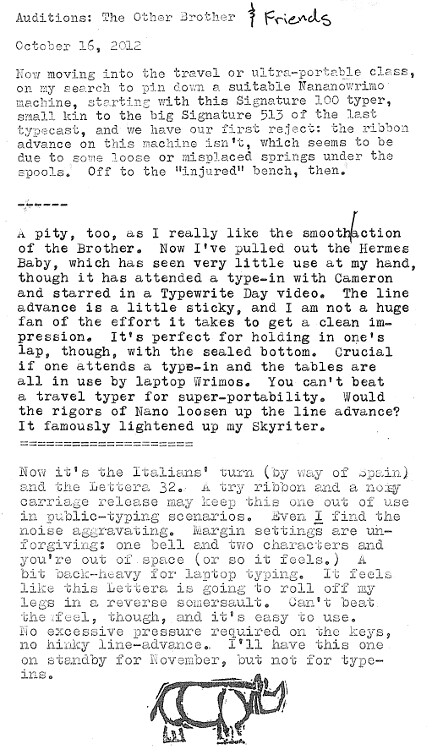
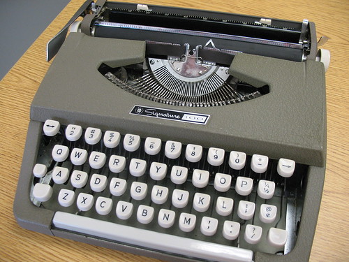
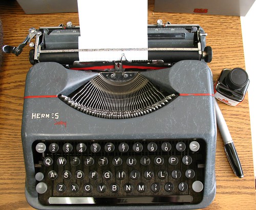
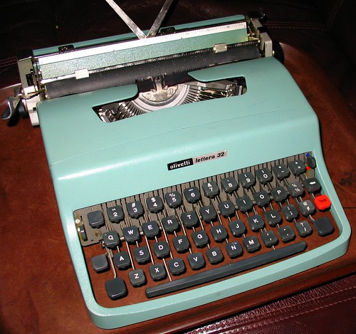
I know that there are better sources for typewriter ribbons than my local office supply big-box store. Jay Respler has his share of business from around the Typosphere, and I've seen Baco Ribbon & Supply mentioned a few times. With my general budget-mindedness, though, I usually opt to roam the printer ribbon section at Staples. They sell 2-inch diameter plastic spools of 1/2-inch wide nylon "printer ribbon" that is meant for a dot-matrix printer. I figure that application is pretty close to that of a typewriter -- short impacts -- and for NaNoWriMo, I'm not as picky about quality.*

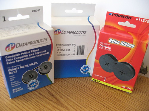
The above photo is the three different packaging variations I've seen over the years, from oldest on the left, to the current supply on the right. The common theme is that they are meant for a line of Okidata printers, in models 80, 82, 82A, 83, 83A, 92, 93, "and others." Also, evidently, the Xerox Phaser 3300.

The spools are nothing special, but the ribbons have the familiar grommet near the end to trip the typical portable reverse mechanism, and are drop-in replacements for many of my portables. The ribbon is all-black, and 12 yards long. They're fairly durable, and I've re-inked them with success.**

These are not the "Universal Typewriter Ribbons" which have the evil strip of flaky, useless "correcting" material on them. I avoid those like a pile of fresh rhino poo, as should you.

* I suspect the cheap ribbons are part of the reason why I have such issues with OCR, since they leave a fine dot pattern inside open letters that sometimes trips up the software. A larger issue for OCR, though, is my bad habit of backing up and over-typing my mistakes. No ribbon is going to fix that.

** Also, with ink. And WD-40. Unlike the delicate re-inking procedures I've seen other folks use, I just drip black ink into the wound-up ribbon, zap it with WD-40 to theoretically spread the ink around (it's a solvent of sorts, right?) and then let it all sit in a sealed plastic bad for a while. The end result is not bad, although sometimes you get bold blotches in your typing where you hit damp spots in the ribbon. Again, it's NaNoWriMo, so my tendency to care about this drops off noticeably.

Tuesday, October 16, 2012

Auditions: The Other Brother & Friends

20121016 typecast

Not a strong showing for the travel typers to say the least. I think I'm getting spoiled on the full-size machines. There's more to go, though.

In order of appearance in this typecast:

Signature 100 (Brother-made):
Signature 100 Typewriter

Hermes Baby:
Hermes Baby, c 1943

Lettera 32:
Olivetti Lettera 32, c. 1975

Saturday, October 13, 2012

I Love October

October planning

I do enjoy this time of year: the seasons (such as they are) are changing, and we seem to be breaking from the hot days, moving into cloudy, cool weather. We've even had the first rain showers of the fall. I'm doing my usual overplanning NaNoWriMo insanity -- writing a sequel to One Last Quest -- and have just had the inspiration that might tie together the main bits of plot that I've been woolgathering in my various scattered notebooks. The pile of index cards is growing... a story is being born.

It's a great feeling.

Thursday, October 11, 2012

Auditions: The Big Brother

20121011 typecast 

Apologies for the grammar gaffes and typos (I do know when to use "its" and "it's", honest.) Can I say I was focused on the spacebar fix and not paying attention to what my fingers were typing? Yeah, let's go with that.


Typed on a Signature 513
Montgomery Ward Signature 513 (Brother), c.1966

Tuesday, October 9, 2012

Friday, October 5, 2012

The Rhino's Curse

The humble Nano Rhino all but stampeded the Typewriter Brigade last year, helped in no small part by Ledeaux at Dante's Wardrobe and her near-bottomless supply of themed clip art. All I can bring to the table is my cheap plastic toy Rhino that I found at a local clearance outlet: the kind of place where "ambiance" means "open boxes on top of shipping pallets." The little guy turned out to be pretty photogenic, though, and has become my writing mascot, and by extension, I've subjected the Brigade to all manner of Ceratomorphic shenanigans.

I'd like to pretend that 2012 will be different, but let's face it: there's no joke like a recurring joke, and the memeification of this little toy provides hours of entertainment when I should be doing something else. Anything else...

Rhino Curse

Never let it be said that I don't share, though. If you'd like to roll your own, I've uploaded a pair of blanks for your own use. I just recently discovered that the "standard" font for memes is Microsoft's "Impact" which satisfied my typographic OCD. Feel free to have at it, and maybe join up with the Brigade while you're at it? We could use procrastinators like you.

Rhino Meme Blank White Rhino Meme Blank Brown

Monday, October 1, 2012

One Month Out

We're one month away from the kickoff. Feeling a little less-than-confident? The secret to Nano is just to power through it, come what may. Kind of like a certain grassland-dwelling mammal we all know... hmmm...

Rhino advice 20121001

Using Richard Polt's "Sholes & Glidden" font.