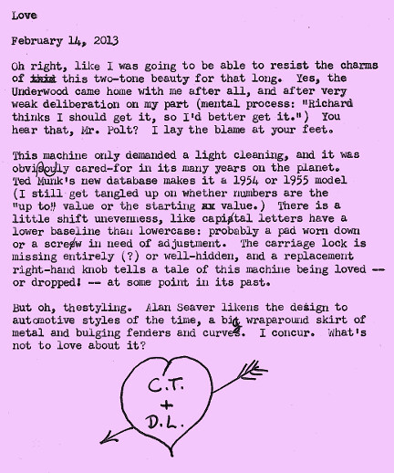
Maybe Alan just has better lighting than I do, but his example looks more burgundy-and-cream. This one is very much a chocolate color. How apt, for Valentine's Day.
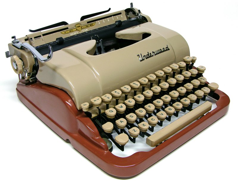
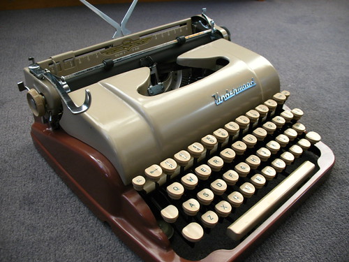
Typed with doe-eyed admiration on a 1954 Underwood De Luxe "Quiet Tab"
It's funny -- I recognized the Underwood typeface immediately, as it closely resembles the one on my Underwood Universal from the late 40s or early 50s.
Congratulations on this great find!
The type alignment on my machine is much more uneven than yours. It gives CHARACTER, I think. Don't mess with it unless it's really bad.
We so often get caught up in trying to make everything perfect, when in fact the uneven type impression is individualistic and in fact, charming. That's part of the beauty of typewriters -- they're NOT computer print-outs!
I KNEW you wouldn't leave that there for long. I know full well that I'd have jumped at it the moment I saw it. Beautiful machine. May your love endure!
Heh, I'd like to think I had a hand in breaking your tissue-paper willpower over leaving that beauty behind. If not, then I'm glad Richard did, because that's one fine addition to your fleet (:

6 comments:
It's funny -- I recognized the Underwood typeface immediately, as it closely resembles the one on my Underwood Universal from the late 40s or early 50s.
Congratulations on this great find!
The type alignment on my machine is much more uneven than yours. It gives CHARACTER, I think. Don't mess with it unless it's really bad.
We so often get caught up in trying to make everything perfect, when in fact the uneven type impression is individualistic and in fact, charming. That's part of the beauty of typewriters -- they're NOT computer print-outs!
Bwahahahahahaha! }:-)
What fun it is to corrupt and seduce.
I KNEW you wouldn't leave that there for long. I know full well that I'd have jumped at it the moment I saw it.
Beautiful machine. May your love endure!
Heh, I'd like to think I had a hand in breaking your tissue-paper willpower over leaving that beauty behind. If not, then I'm glad Richard did, because that's one fine addition to your fleet (:
Congratulations on the Underwood.
Underwoods have a distinctive and nice typeface.
I fell in love with that machine when I saw E.B. White using one in an old photograph.
Post a Comment