Showing posts with label paper. Show all posts

Tuesday, December 2, 2014

Rhodia Paper Project: Weeks 1-5

The fine folks at Exaclair, Inc. are the US importers of Rhodia paper products, and being the slavering fanboy that I am, I was very pleased to see them running the "Rhodia Paper Project" from their blog, whereby other fanboys/fangirls could sign up to get samples of their various products mailed to them on a weekly basis to test out, in return for comments and feedback.

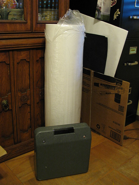
This had the back luck to happen just before NaNoWriMo kicked off this year, and although I've been diligent about signing up each week via Rhodia Drive, I've been pretty slack about testing or commenting, because, you know, noveling. I'm digging out after my win now, and am making up for lost time...

Week 1: Your choice of grid

The contenders:

  • Rhodia Ice: white/grey/graph
  • Rhodia 80th Anniversary ivory/grey/graph
  • Rhodia Classic white/blue/graph
We start off by trying out the various forms of grid colors. I personally like using graph-style paper if it's available, especially for note-taking and NaNo plotting since I have terribly slop handwriting, and tend to drift all over without guidelines. I've got some notebooks old enough to have bluish grids, which I think Rhoida has since replaced with a violet ink (more eco-friendly sources, I gather.) My go-to ink color is blue for just about everything -- easy to tell when it's been photocopied -- so this week was about testing which ink I liked best against the three different grids and the paper colors.

I was predisposed not to like the ivory paper, which seemed a little faded or even dirty compared to the clean white of the other two. Maybe it's the grid talking, but it seems like the grid shouts "professional and serious" and the ivory paper says "quaint drawing room." I am also surrounded by white office paper all day, and use it in my meeting notebooks, so again, bias.
  • Rhodia Ice: white/grey/graph 
This was my favorite of the three samples, by far. The gray grid is very light on the paper, clear enough to see, but not clashing with any of the inks or pencils that I tried on it. The paper is the lighter of the two weights supplied (90g vs. 80g) but this is not paper you're going to send letters on, most likely. The grid says "serious" to me, and would be appropriate in a lab or classroom.
  • Rhodia 80th Anniversary ivory/grey/graph
My least favorite sample of the three, though the grid is subtle, and against the ivory paper, looks almost brown. I can't get past the color for this application, though. Clearly this is a personal moral shortcoming.
  • Rhodia Classic white/blue/graph
Second choice, and the one I already own in different sizes. In comparison to the "Ice" product, the lines are very visible, and especially when using blue ink -- the grid tends to clash more with my writing instead of fading invisibly into the background like the gray.

Week 2: Take a letter

The contenders: 

  • Clairefontaine Graf It
  • G Lalo Stationery (white)
  • Clairefontaine Triomphe
The second week is all about stationery, so the samples are unlined and plain. This is what you write your post-holiday thank-you notes on, and in that context, everything I said above pretty much goes out the window here. There really is a time-and-place for various papers, something I've not given much thought to before.
  • Clairefontaine Graf It 
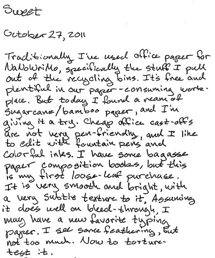
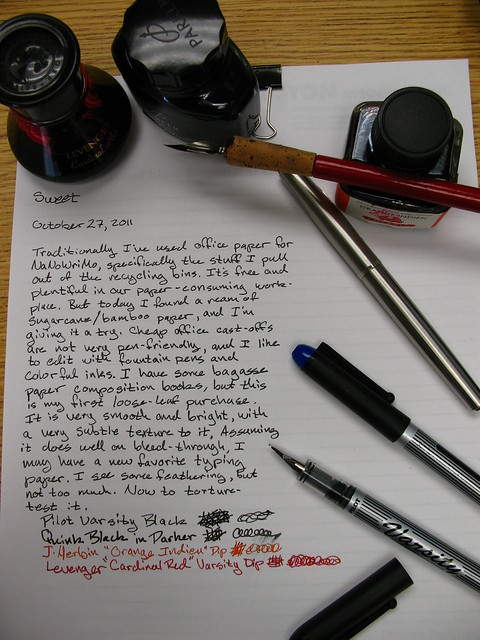
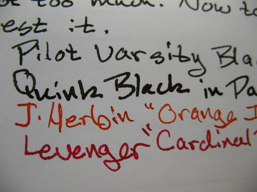
Plain white, and with a slight, subtle texture on the surface. This is nice stuff, 90g, and was grippy enough to use pencil -- some of the regular Rhodia paper has a slickness that's welcome with fountain pens but disconcerting with a pencil. You need a little friction, and this has it. It reminds me very much of the bagasse (sugarcane waste) paper that I use for NaNo typing, with a little toothiness, but heavier than cheap old office paper. I would not be sad to own a pad of this with some ostentatious monogram in the corner.
  • G Lalo Stationery (white) 
Though this says "white," compared to the other two samples, it's a very light cream color. It has visible horizontal texture lines to it, and a subtle vertical line (watermark?) every 3cm. I was predisposed to dislike this entirely, expecting it to be grabby, toothy, and hard to use with my preferred pens. I'm pleased to say that I'm wrong on all fronts. Pencil behaves nicely even when writing lightly, and fountain pens give just the right amount of feedback. This is languid, letter-writing paper, and the color for this application is perfect. The clear winner.
  • Clairefontaine Triomphe
Of the three, my least favorite, though it's like trying to choose amount three very-good things. The same weight as the Graf It, but utterly smooth, like Rhodia pads, and as such, badly-behaved with pencils. Fountain pens skate all over the surface as expected, and the gel rollerballs I was testing with were so quick it felt like driving on ice. I would not say no to this if it were foisted on me in a dark alley, for sure, but if you're going to do correspondence, treat yourself and the recipient to one of the other two.

Week 3: The journal selection

The contenders:  

  • 5×8 Webnotepad Lined, (same as Webbie paper)
  • 6×8 Lined R
  • 6×8 Lined Rhodia 80g 
Week three is what I think of as the "journal selection." It's an odd size paper for my own needs, which tend toward the letter-size or A4 notebooks. These are all lined, with big broad spaces. Lots of room for inmost thoughts, I suppose. I don not have a rich inner life that requires documenting.

  • 5×8 Webnotepad Lined
  • 6×8 Lined R
 A tie this week, and mainly because the difference falls between if you want a little extra width as in the "R" pad, or rounded bottom corners as in the "Webnotepad." The "R" is top-perforated, like many of their notebooks, so it's entirely possible this is meant for less permanent writing. The other is not perforated -- the sample has clearly been torn out of a pad -- and if you're keeping a journal, that seems like it would be of more use to you. I have an unlined Webbie that accompanies me to back-to-school nights, kids' sport meetings, and other real-life/non-work situations where I need to jot down notes and numbers, and don't want to lose them. Both pages are 90g ivory, with the grey lines, and again, for this use, I can see it being superior to the white-with-blue.
  • 6×8 Lined Rhodia 80g 
Another choose-among-very-good-things, but this has a large red margin rule down the left side -- "large" here meaning 1 1/2" of space, which is a quarter of the page width. This feels really wide, and if you're even the tiniest bit OCD (ahem) it may bother you that so much "good" paper is going to waste over there, especially if you grew up with the cheap filler paper and spiral notebooks like I did, with the margin line dancing dangerously close to the holes punched in the paper.

Week 4: Colorful students

The contenders: 

  • 1 sheet of the 8×11″ Clairefontaine Pastel Graph paper
  • 1 3×5″ Exacompta Pastel Index Card
There are times when I regret not being a student again, because I've since learned quite a bit about note taking, organization, and the excitement of a well-stocked university bookstore. Then a come to my senses and remember the terrible food, crushing debt, and general lack of sleep, and am glad I'm gainfully employed instead. This week isn't so much a comparison as just a taste of products that I would totally send to student-version-me, once I get that time machine worked up.
  • 8×11″ Clairefontaine Pastel Graph paper
Normally I could give a pass on pastel paper, but this is pressing all my organization-nerd buttons: bound in a spiral notebook with perforations for easy removal. Heavy 90g paper with a grid on both sides. My sample was a light blue sheet, and the normal Rhodia purple grid looks fine against it. There's an index tab cut out of the side for indexing the notes, and I'm guessing this comes in a multi-subject notebook offering many sections of different colors. The grid is ideal for math formulas and structured notes. I wish I would have used graph paper all through my computing classes.
  • 1 3×5″ Exacompta Pastel Index Card 
Actually, two in my envelope: one green, and one yellow. Unlike cheapo index cards, the grid is on both sides, they are heavy paper (205g), and of course, pen-friendly. I used index cards to remember (i.e., cram) everything before exams. Past-student me would have certainly matched up the cards to the notebook colors, just because.

Week 5: Size does matter

The contenders: 

  • No. 8, (3 x 8 ¼”)
  • No. 10 (2 x 3″)
  • No.16 (6 x 8 ¼ “)
  • No. 19 (8 ¼ x 12 ½ “)

The best thing about Rhodia products -- aside from general pen-compatibility -- is that there's a size for every purpose. The worst things about Rhodia products is that there's a size for every purpose. The choice alone can be overwhelming, and in those rare cases when I am in a retail store that actually sells them, just spinning through the rack gets me a little dizzy... as in I could totally buy ten of these and use them for... I don't know what...

Like the previous week, these don't lend themselves to being compared with one another. They are all lined in violet on 80g white paper. The largest sizes have the same wide margin, and all are top-perforated.
  • No. 8, (3 x 8 ¼”) 
If you don't have a ruler handy, think "bookmark size" or "shopping list size." I own a gridded variant of this, and I use it for both purposes. It's just wide enough to get a decent list written down, and plenty long for use as a notes/bookmark. Consider using one to keep characters straight in your next Russian novel.
  • No. 10 (2 x 3″)
Almost comically small, just a little larger than half a business card. Small enough that you could keep one each in your pocket, bag, car, desk, stuck to the fridge on a magnet, glued to the dog, etc.. The lines are pretty well spaced apart given the amount of paper you're looking at here. Maybe for composing tweets offline? I struggle to find a use for this, other than as the ultimate tiny notebook when you need to jot down some critical fact, like, to pick a random example out of the air, the name of a piece you heard on the car radio, forgot, and then have spent a decade trying to remember. Just for example.
  • No.16 (6 x 8 ¼ “) 
See Week 3 for thoughts on this size. Tucked in with other lined samples, I can see this being most useful as the by-the-phone doodle and message pad, maybe the tote-to-a-meeting pad where you don't want to commit to actually taking a large number of notes, but don't want to get in trouble for staring at your phone the whole time, either. I personally find this size just a little too small for my writing needs at work, and too big to carry around casually.
  • No. 19 (8 ¼ x 12 ½ “) 
Ah, now we're talking. This is A4 sized, a little narrower and a little longer than a US Letter size, and the one I'm used to for my own meeting notes (I'm working through a backlog of old Black n' Red A4 notebooks.) The left margin is just as wide, almost wanton, but at least in the larger format, it can be used to call out points of interest: flagging to-do items is an obvious use case for me. I do like bringing paper to meetings, and having a whole year's worth of meeting notes in one place has proven invaluable to me, since I can flip back and reference old notes. The Rhodia is in a top-bound orientation, though -- like a legal pad -- and that I would find less useful than the spiral-bound books I use now. Of the four samples, though, this one has the most utility for me, and I could get past the top-binding pretty quick. I suspect the paper would hold up to disc binding very well if I needed to make an archive notebook. A future sample is slated to include their "meeting book" paper, which looks to be just about perfect. I think I'm ready to graduate beyond the simple lined-only books in the (sigh) five years when the Black n' Reds run out. Or sooner, if they meet an "accident."

Monday, March 10, 2014

Paperlympics: Qualifying Round Results

Buried somewhere in that silly post featuring toy rhinos and brass 'roos was the question: is a yellow Rhodia pad "toothier" than a white pad, though they are -- in theory -- the same paper?

Paperlympics: the parade of champions

My own scribble testing results in an unequivocal yes. The paper is noticeably different, using the various writing instruments shown above, plus a few others I tossed into the mix after the initial results. And to tell you the truth, even knowing what to expect, I was surprised that I could detect the difference so easily.

All the pencils were far quieter on the white pad, and noticeably louder on the yellow. This was especially pronounced in the mechanical pencil, which maintains a very narrow tip, but even that big chunky Moleskine pencil was markedly different. The yellow paper absolutely gives more feedback as you're writing on it. The white pad is nearly ninja-silent with a pencil.

Almost all of the pens I tried with a "fine" or "medium" nib exhibited the same properties: more feedback, a touch more noise. My red Sheaffer school pen is notoriously scratchy on cheap paper, and I tend to use it only on nicer paper as a result. It magnified the difference in surfaces between the two pads, though it wasn't unpleasant on either. Most medium-nib pens were noticeable. Only when I moved up to the italic-nibbed Pilot did the differences go away. Perhaps the wideness of the nib skates over the tiny surface differences, or I'm just not a good enough penman to know the difference.

Given this result, I brought out a couple more extreme examples: a super-fine rollerball pen, a couple of colored pencils, a cheap ballpoint, and a broad calligraphy nib in a plastic Sheaffer, cousin to the school pen. All except the calligraphy pen were different. What's more, the Calligraphy pen revealed tiny amounts of feathering on the yellow pad, and even a few pinpoints of ink bleeding through. Were I a calligrapher and not just some slob, the yellow paper would be demoted to the "practice only" pile.

The last thing I've tested out is front-versus-back. Paper has a finishing step when it's made, and I remember from a few mis-spent summers as an all-around-office-boy that there's a "right" and a "wrong" side to paper. Wikipedia has a piece on paper sizing if you want to know more -- sizing as in finishing, not on paper sizes, which is a different article. The final round of tests was comparing writing on the front and back. I'm less sure about this test: sometimes I'd swear that the back of the white paper was rougher than the front of the yellow, at other times there were about the same. If there is a quality difference between front and back, it's a tough one to discern.

Three final observations to make, and then scans of the front-side tests are after the break.

First, the white paper is cooler to the touch, as in temperature-cool, not leather-jacket-and-Harley cool. I'm positioned underneath an air vent which can't help, but by resting a hand on each, the yellow paper warms up faster. Color difference? Surface difference? The magic of thermodynamics is at play, anyhow. There's a thesis in there for a physics student, perhaps.

Second, the yellow paper just seems thinner. I don't have any reason to doubt the stated weight on the cover, and have no way to verify it beyond just a shake test, and noticing things like ink bleed-through and show-through. For an extreme test, I have a disposable fountain pen filled from one of those inkjet printer refill kits which practically pours ink down the nib. The resulting letters show through on the yellow, less so on the white, though neither are very happy with trying to hold that much ink. I didn't say it was a fair test.

Third, and finally: although the yellow may have come out "worse" here, it's the better of the two in certain circumstances. If I were a student and using pencils on a regular basis, the white paper is quieter and smoother, but the yellow is surely easy on the eyes after a weekend binge or an unfortunate move to Daylight Savings (or both.) Some of the pens find the white paper almost too smooth. The Pelikan, for instance, always wants to skip on the white, but is fine on the yellow where the surface of the paper and the capillary action of the nib mumble mumble mumble handwave it just worked better, OK? This is not an unusual circumstance for pen owners, as we're always looking for excuses to buy more supplies find the perfect combination of pen/paper/ink. It's the El Dorado of the ink addict.

So, there you go, Exaclair -- a highly unscientific and unfocused confirmation of your own customer feedback.

When my daughter and I get the chance, we're going to kick off our own more involved tests at home, comparing to other brands of yellow and white writing pads. Stay tuned for that, and a return to rhino-and-roo, the paper pals.


Wednesday, March 5, 2014

Paperlympics: Opening Ceremonies


For best effect, play while reading...

When I saw the post last month on Rhodia Drive about the chance to test-drive a pair of their writing pads -- one with yellow, one with white paper -- I was perhaps a tiny bit interested.  I already have a professed love for the bright orange brand, having been turned on to its magical ink-friendly properties by the enablers at Fountain Pen Network. And I know the generosity of their marketing department with samples, so of course I threw the Clickthing hat in the ring, and then waited (im)patiently for a confirmation email, and ultimately a package from Exaclair. The package arrived yesterday, and I am not disappoint, as the kids say.[1]

Paperlympics: the parade of champions
Two A4 tablets, 80 pages each... oooh, be still, my paper-lovin' heart

You can go back and read the original post, but the upshot of this trial is: the yellow paper is "toothier" than the white. It's already been confirmed by Stephanie at Rhodia Drive, but this offer is to try it out with other writing instruments, and then report back to Exaclair/Rhodia HQ. As I love me a paper test, I of course set to gathering the competitors in what I'm modestly calling:


The Paperlympic Games of 2014

I agreed to test them out with pens, and test them I shall. And since I'm curious, I also want to try them out with whatever pencils I have here or could scrounge from the office supply room at work. You can see them in their parade formation as they entered the stadium, but we caught them in a more relaxed moment back in the athlete dormitories.


The Athletes

Paperlympics: athlete village
The competitors, in a moment of repose

Like Sochi, there are some small issues of comfort that need to be sorted out, but generally everyone is happy. From left to right, the competitors are:
  • Representing the Czech Republic: the Moleskine brand 2B hipster pencil
  • Representing probably China: the Sanford Clickster 0.5mm mechanical pencil
  • Laying crosswise, another China entrant: the Dixon Ticonderoga 2HB woodcase pencil
  • From the United States of America, a late-80s vintage Sheaffer school pen, F nib with period Skrip jet black ink
  • Representing Germany, the Lamy Safari, F nib with Lamy blue ink
  • Also from Germany, a Pelikan m205, M nib with Waterman Serenity Blue ink from France
  • From, um, Levengerland, a True Writer demonstrator, M nib with modern Sheaffer Skrip blue/black from Slovenia
  • From Japan, a Pilot Knight with a M italic nib from a Plumix pen, inked with Pilot/Namiki blue/black
Let's have a round of applause for them, everyone!


The Field of Competition

For the qualifying round, athletes will go head-to-head on these carefully-manicured surfaces.

Paperlympics: fields of competition
All markings follow IPC guidelines

On the surface -- ha! -- this paper appears to be the same. Both are 80g/m2 "High Grade Vellum Paper," both lined with margins. Both feature heavy foldover covers and a stiffish piece of cardboard affixed in the back to provide support for writing. Both are staple-bound with a fine perforation along the top edge to enable easy removal. Both feature Rhodia's purple lines with a red margin, though the lines appear darker on the yellow paper, and a bit brown, likely thanks to the color contrast.

Identical but for paper color, yes? Well, that's what we're here to find out.

For more, let's go over to the field where our on-the-scene reporters are standing by with some insightful color commentary.

Paperlymics: a field report
This does not bode well

Roo: Too right! It's as pale as a wallaby's bumhole! [2] Crikey! Uluru!

Rhino: O HAI I SEE YELLO

...

Annnnnnnnnd with that, we'll go back to the studio.


The Judging

This one's a little tough, since I'm coming in with a bias; I know that I'm expecting the yellow pad to be a little scratchier with a pencil, so I'm mainly looking for other differences in feel between the two surfaces with the different instruments. It'll be as scientific and impartial as a blog post can be -- that is to say, it'll be chock full of baseless opinions [3] in which accidental facts may unintentionally appear.

I'm going to use each of these for the next week or so, and write up my opinions-carefully-phrased-as-facts, share them with Exaclair, and you lucky readers. Both of you.

But it doesn't stop there! In the interest of true fairness, and to explore the whole notion of blind studies and the scientific method, there is a second, longer portion to the Paperlympics. Just as the real Olympic games feature countless variants on "two people ice skating together" [4] so, too, does the full-blown Paperlympics finals have an excruciating number of nearly-identical events.

I've prepared a number of samples of paper, in which the Rhodia is secretly mixed, for my daughter and I to test out at home. In this way, we'll be putting it not only through the paces of the paper-obsessed office worker, but also the rigors of the typical tweenage homeschooler. And we'll be turning it into something of a science lesson, too, by checking properties, assigning scores, and in the end, looking at the samples under a microscope (because science.) She doesn't know which sample is which, so I'm hoping to eliminate at least a shade of bias. I will attempt to refrain from comments like "this next one is TOTALLY AWESOME AND FREE so score it accordingly, won't you?"

But first, we need to get through the early rounds of this fine, traditional, just-made-it-up-last-week sport. If you're anything like me, you just want to skip ahead to the finals and see if there's any spectacular crashes. Be patient! I'm sure with me at the helm, disaster cannot be too far behind.

So, sports paper fans, stay tuned! We'll be back with results after this commercial break.


[1] No kids actually say this.

[2] No Australians actually say this.

[3] Opinions, it is said, are like bumholes. Everyone has one, and you should keep yours private. Especially if you're a wallaby.

[4] All of which are shown on evening TV at the expense of any other events, not that I'm still bitter, NBC-I'm-looking-at-you. Thank goodness for DVRs and/or perfectly legal streaming.

Wednesday, August 28, 2013

BABAROP: Look Out, Baby!

BABAROP

The missus ordered a roll of butcher paper to cover our dining room table when it's school time for my daughters. It's 30 inches wide by 900 feet long. It's a BABAROP*

I'm not sure how many NaNoWriMo drafts that works out to be. Included in the photo above is a Hermes Baby, for scale. I'm genuinely scared for the Baby's future. A piano suspended overhead would be less menacing.

This might be just the thing for anyone with one of those super-long-carriaged accounting machines. How many lines per day would meet your quota? "I typed two and a half yards today."

More to the point: do you think I can convince her to order another?

* Big-Ass Big-Ass Roll Of Paper

Thursday, October 27, 2011

Sweet

20111027 pencast

Our scanner at work is black and white only, so here's a photo of my ad hoc test setup. The lines you can see on the paper are shining through from a lined pad I put underneath the sheet.
Bagasse paper stress-test

Ink feathering detail:
Bagasse paper feathering

Paper texture detail:
Bagasse paper texture detail

The paper is by Sugarmade, and is acid-free, 20#, 92 brightness.

Wednesday, March 31, 2010

Orange You Glad

Chalk one up for the Twitterverse, for through that I found out about Exaclair offering an ink-and-paper-sample giveaway over St. Patrick's day. Specifically, a sample of either green or orange ink from J. Herbin plus a bit of Clairfontaine paper to try it on. I've yet to get orange ink all over myself, so that's the one I requested, and joy! it arrived today...

J. Herbin "Orange Indien" + Clairefontaine cahier

First, let me say that I was expecting maybe a little plastic vial of ink and a couple of sheets of paper, stuck into an envelope. What I was not expecting was the arrival of a well-packed box containing what you see above: a 30 mL bottle of ink and a 48-page 3 1/2" x 5 1/2" soft-cover cahier. So just after the unboxing I'm already experiencing epic win.

Luckily for me, the win didn't stop there. This is a very well-behaved ink: I've swabbed it on a small Canson lined notebook, on a Black 'n Red spiral notebook that I use for work, on my small Rhodia #11 pad, and on a composition notebook from Staples made of bagasse paper (sugar cane remnants.) All four are known to be fountain-pen-friendly, and they did not disppoint: only on the Canson did I detect slight feathering from the swabbing, and none of papers even hinted at bleeding through. I torture-tested the Rhodia pad by swabbing back and forth over the same area for a while, and except for some wetness-induced curl, it behaved perfectly. Finding the good combination of ink and paper can be tricky, but no tricks are needed here.

The color in the bottle is almost iodine-like -- the resemblance was particularly strong on the swabs and (sigh) on my skin -- but on the page it is far lighter. This ink is aptly named -- Orange Indien -- for it puts one in mind of saffron or curry: it is certainly orange, but not neon colored. It's quite readable on a page by itself, which was one of my concerns after I selected it: fountain pens make poor highlighters, as the ink is water-based and will gladly smear any water-based ink they cover. My super-swabbing test on the Rhodia pad was over a section I'd written in ballpoint, which is oil-based ink, and there was no smearing or blurring as expected. But I would not devote this ink to life as an accent color. It dries a bit more slowly than the my everyday inks -- Quink Black and Waterman Florida Blue -- but perhaps because of this and the color, the dried ink exhibits the nice shading characteristics you expect when you think "fountain pen." And unlike other brightly-colored inks I've used, there doesn't appear to be any little "clumps" of dye. I'm going to leave it in the Parker that I loaded up to see how it behaves longer-term.

Overall, I'm very pleased with this, and send special thanks to Karen Doherty at Exaclaire, Inc. for sending these along. It was a pleasant surprise, made all the more pleasant by the high-quality ink and paper inside.

Tuesday, December 8, 2009

Friday, January 16, 2009

Warming the cockles

Still reeling with secret jealousy over Strikethru's latest retail treasure, I made my usual thrift rounds today at lunch in search of a fish sculpture (don't ask.) A complete bust on the fish, but look what I uncovered instead.

Onionskin


Wrapped for your protection I feel like a wine nut that's just found a bottle of rare Château Snooty at the local swap meet. It's brand-new, still wrapped in tattered plastic, a band around the sheets of delightfully nubby, super-light paper. It's been years since I held a sheet of this stuff. I promised myself that I would not covet the fine paper collections of my fellow typecasters, that using the backs of cheap office cast-offs would do me just fine. I'm of midwestern stock, I'm supposed to be Practical and Sensible about this sort of thing.

Did I mention that I can't stop sniffing the paper? I hope Southworth didn't treat their papers with anything noxious, or I'll be getting an unintentional contact high, and I'm already a bit giddy.

Thursday, April 24, 2008

Buried treasure

We go through a lot of paper in my office, as our primary output is large financial reports and supporting documentation. As a result, our office recycling bins are kept pretty full of paper, and it's not unusual to see a delivery person dropping over several cases of copy paper in our supply room. It's not genuine typing paper, but as there's an ample free supply, I have been helping myself to the castoffs for the past few months, since the typewriter affliction first struck. In that short time, I've accumulated several hundred sheets of used-on-one-side castoffs, more than enough for my typecasting and multiple drafts of Nano novels, plus enough to keep me in a supply of paper hats and origami cranes for years.

I found a Large Steel Box of mysterious heritage at the thrift store (yes, I live there) that seemed perfectly suited for the task of holding these cast-offs. A large, steel box with a hinged lid, a bright red "BM*T PAPER" decal on the front. PAPER it says, and so PAPER it holds, sitting snugly at my feet under my desk like a small dog. A few of my coworkers have learned of my typer obsession -- hard to ignore the clicking and dinging -- and have even taken to leaving me little bundles of blank sheets in my mailbox, or sitting on my desk. A neat white offering for the treasure chest.

This isn't really intended to be a green eco-hugger-type post; I'm collecting the paper out of cheapness, and to prevent the pangs of wanting to find real typing paper elsewhere. I am actually excited about my collection, as it is a box full of potential. Since it's scrap, I don't feel like I need to fill it with worldly pronouncements (ha!) or Great Art (ha ha!) but can grab a few sheets, load them up, and just type.

Update: photo of "the vault" now on flickr.