Showing posts with label fountain pen. Show all posts

Tuesday, August 5, 2014

Pen Review: Namiki Vanishing Point

Time again for some pen geekery...

Namiki Vanishing Point

Maybe not a full review, since I've only had it for about 18 hours now, but at least a first-impressions review. tl;dr: I'm very happy with the choice.
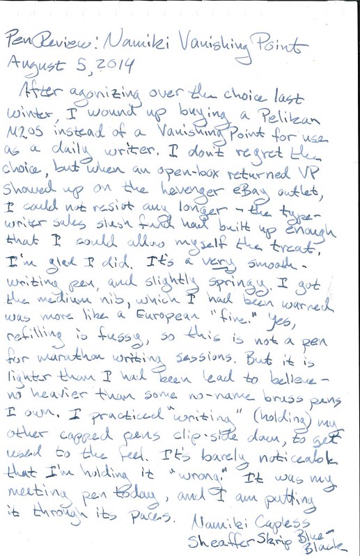
20140805 pencast

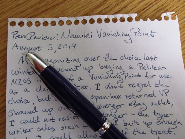
I have no great love for eBay and I can usually pass up some of Levenger's more esoteric or expensive options, but I am known to haunt their online outlet store. They have famously excellent customer service, so when the listing said "like new, appears to have never been used," they weren't joking. I'm not sure who received/bought this originally and returned it, but thank you. The blue is just sedate enough to look professional, and just happens to be my preferred color. Well done.
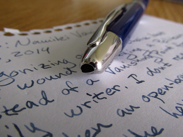
Namiki Vanishing Point - Closed

The mechanism on the vanishing point is pretty clever: this little chromed tailpipe has a tiny flap inside that the nib pushes open when the pen is engaged. The barrel of the pen is serving more like a sheath. The downside is that you're limited in refilling options, since the whole writing mechanism is being moved around in there, so there's no practical way to also add a piston or snorkel.

Levenger helpfully included a cartridge, squeeze converter, and a piston converter. I already have other Pilot/Namiki pens about, too, so care and feeding is covered.
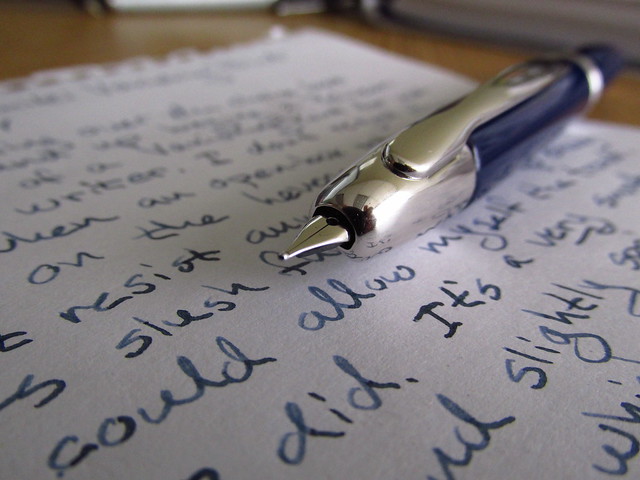
Namiki Vanishing Point - Open

I've heard that new nibs can sometimes squeak a bit when they're first used. I haven't encountered that. I'm not sure if it happens every time or if I lucked out, or if my pre-inking ritual of flushing out the works with water did the trick.

You can see the slightly indented sides on the clip where your fingers are supposed to rest. I don't find this obtrusive at all when I'm writing. It's a subtle tactile guide to holding the pen properly with a triangle grip. Supposedly the tinier nibs can run a bit toward the dry side, so I've read about VP owners choosing a fine enough nib to conserve ink vs. picking a nib that's smooth and not scratchy. I'd personally recommend the Medium, and you can see that it's shading nicely on my scratch pad of sugarcane (bagasse) paper. Just don't wander too far from a bottle of ink or supply of cartridges. There's no window for checking ink levels.

Why go capless? Both because of the sheer coolness of the thing and the convenience. I don't post my pens when I write, that is, I don't stick the cap on the back of the pen. Partially this is out of a desire to keep it looking nice and not scratch up the barrel or crack the cap. Also, it's a good way to ensure that your pen comes back home to you when you let someone borrow it: keep the cap in your other hand. :-) For meetings, or quick notes, or one-handed writing situations (e.g., standing up), a click pen is convenience itself. I will say, though, that the argument that a VP keeps the nib pointed upright ("No leaks!") is just silly. Regular capped fountain pens should be stowed nib-up in your pocket or a case. It's nothing special or unique to a capless pen. Most fountain pen owners who value their wardrobe learn quickly to keep them upright when not in use, and not shove them into a pocket nib-end down. Gravity: it's the law.

Thursday, April 10, 2014

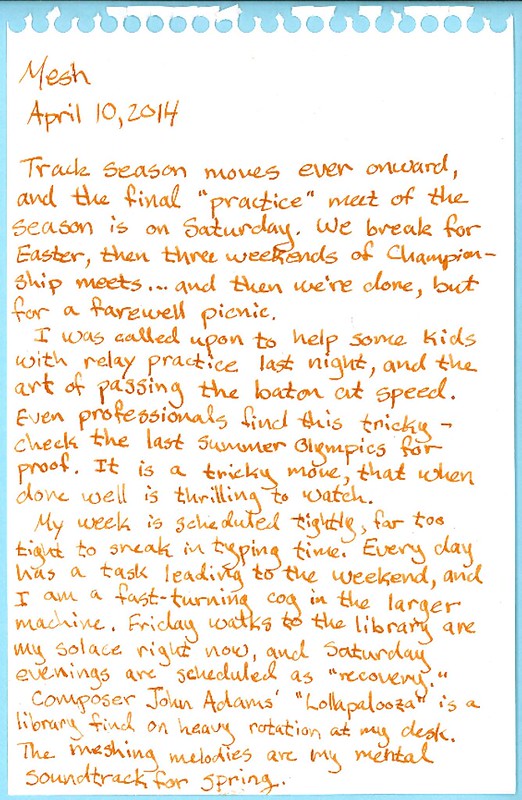
Mesh

20140410 pencast

Adams may not be everyone's cup of tea. I've only been recently exposed to him through a piece on an anthology album, and then recognized his name while browsing the CDs at the library. As both a former brass player and a lover of intertwined, complex music, this pushes my buttons in grand ways. I bet it would be fun to play, if the counting didn't drive you crazy.

This is pretty much what it's like in my brain these days...


Does it remind anyone else of a room full of typewriters?

Wednesday, March 5, 2014

Paperlympics: Opening Ceremonies


For best effect, play while reading...

When I saw the post last month on Rhodia Drive about the chance to test-drive a pair of their writing pads -- one with yellow, one with white paper -- I was perhaps a tiny bit interested.  I already have a professed love for the bright orange brand, having been turned on to its magical ink-friendly properties by the enablers at Fountain Pen Network. And I know the generosity of their marketing department with samples, so of course I threw the Clickthing hat in the ring, and then waited (im)patiently for a confirmation email, and ultimately a package from Exaclair. The package arrived yesterday, and I am not disappoint, as the kids say.[1]

Paperlympics: the parade of champions
Two A4 tablets, 80 pages each... oooh, be still, my paper-lovin' heart

You can go back and read the original post, but the upshot of this trial is: the yellow paper is "toothier" than the white. It's already been confirmed by Stephanie at Rhodia Drive, but this offer is to try it out with other writing instruments, and then report back to Exaclair/Rhodia HQ. As I love me a paper test, I of course set to gathering the competitors in what I'm modestly calling:


The Paperlympic Games of 2014

I agreed to test them out with pens, and test them I shall. And since I'm curious, I also want to try them out with whatever pencils I have here or could scrounge from the office supply room at work. You can see them in their parade formation as they entered the stadium, but we caught them in a more relaxed moment back in the athlete dormitories.


The Athletes

Paperlympics: athlete village
The competitors, in a moment of repose

Like Sochi, there are some small issues of comfort that need to be sorted out, but generally everyone is happy. From left to right, the competitors are:
  • Representing the Czech Republic: the Moleskine brand 2B hipster pencil
  • Representing probably China: the Sanford Clickster 0.5mm mechanical pencil
  • Laying crosswise, another China entrant: the Dixon Ticonderoga 2HB woodcase pencil
  • From the United States of America, a late-80s vintage Sheaffer school pen, F nib with period Skrip jet black ink
  • Representing Germany, the Lamy Safari, F nib with Lamy blue ink
  • Also from Germany, a Pelikan m205, M nib with Waterman Serenity Blue ink from France
  • From, um, Levengerland, a True Writer demonstrator, M nib with modern Sheaffer Skrip blue/black from Slovenia
  • From Japan, a Pilot Knight with a M italic nib from a Plumix pen, inked with Pilot/Namiki blue/black
Let's have a round of applause for them, everyone!


The Field of Competition

For the qualifying round, athletes will go head-to-head on these carefully-manicured surfaces.

Paperlympics: fields of competition
All markings follow IPC guidelines

On the surface -- ha! -- this paper appears to be the same. Both are 80g/m2 "High Grade Vellum Paper," both lined with margins. Both feature heavy foldover covers and a stiffish piece of cardboard affixed in the back to provide support for writing. Both are staple-bound with a fine perforation along the top edge to enable easy removal. Both feature Rhodia's purple lines with a red margin, though the lines appear darker on the yellow paper, and a bit brown, likely thanks to the color contrast.

Identical but for paper color, yes? Well, that's what we're here to find out.

For more, let's go over to the field where our on-the-scene reporters are standing by with some insightful color commentary.

Paperlymics: a field report
This does not bode well

Roo: Too right! It's as pale as a wallaby's bumhole! [2] Crikey! Uluru!

Rhino: O HAI I SEE YELLO

...

Annnnnnnnnd with that, we'll go back to the studio.


The Judging

This one's a little tough, since I'm coming in with a bias; I know that I'm expecting the yellow pad to be a little scratchier with a pencil, so I'm mainly looking for other differences in feel between the two surfaces with the different instruments. It'll be as scientific and impartial as a blog post can be -- that is to say, it'll be chock full of baseless opinions [3] in which accidental facts may unintentionally appear.

I'm going to use each of these for the next week or so, and write up my opinions-carefully-phrased-as-facts, share them with Exaclair, and you lucky readers. Both of you.

But it doesn't stop there! In the interest of true fairness, and to explore the whole notion of blind studies and the scientific method, there is a second, longer portion to the Paperlympics. Just as the real Olympic games feature countless variants on "two people ice skating together" [4] so, too, does the full-blown Paperlympics finals have an excruciating number of nearly-identical events.

I've prepared a number of samples of paper, in which the Rhodia is secretly mixed, for my daughter and I to test out at home. In this way, we'll be putting it not only through the paces of the paper-obsessed office worker, but also the rigors of the typical tweenage homeschooler. And we'll be turning it into something of a science lesson, too, by checking properties, assigning scores, and in the end, looking at the samples under a microscope (because science.) She doesn't know which sample is which, so I'm hoping to eliminate at least a shade of bias. I will attempt to refrain from comments like "this next one is TOTALLY AWESOME AND FREE so score it accordingly, won't you?"

But first, we need to get through the early rounds of this fine, traditional, just-made-it-up-last-week sport. If you're anything like me, you just want to skip ahead to the finals and see if there's any spectacular crashes. Be patient! I'm sure with me at the helm, disaster cannot be too far behind.

So, sports paper fans, stay tuned! We'll be back with results after this commercial break.


[1] No kids actually say this.

[2] No Australians actually say this.

[3] Opinions, it is said, are like bumholes. Everyone has one, and you should keep yours private. Especially if you're a wallaby.

[4] All of which are shown on evening TV at the expense of any other events, not that I'm still bitter, NBC-I'm-looking-at-you. Thank goodness for DVRs and/or perfectly legal streaming.

Saturday, February 8, 2014

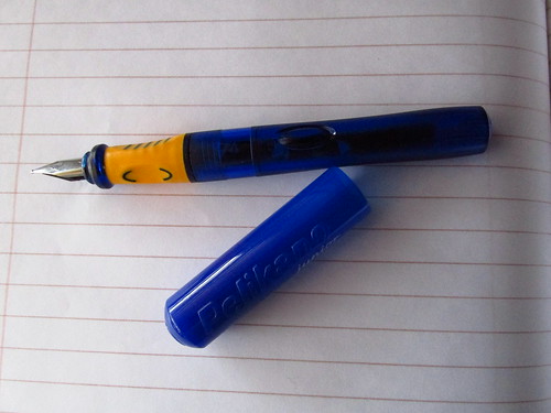
Plastic Pen Showdown: Pelikano Junior vs. Lamy Safari

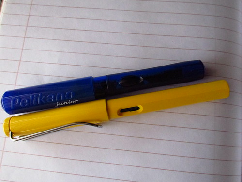
Lamy Safari vs. Pelikano Junior, capped

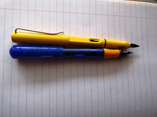
Lamy Safari vs. Pelikano Junior, posted

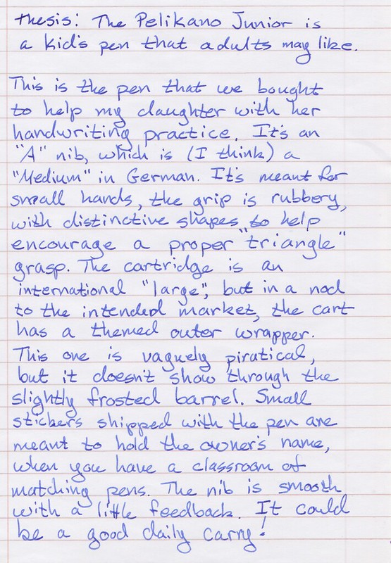
Pelikano Junior pencast

Pelikano Junior

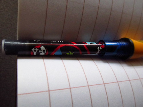
Pelikano Junior ink cartridge

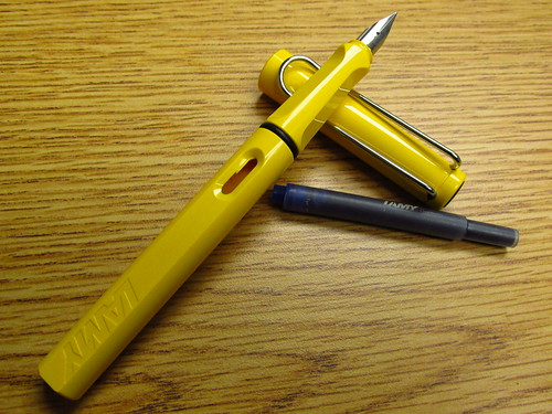
Lamy Safari

Lamy Safari pencast

Personally, I think pirate-themed ink carts are pretty awesome, and the world would be a better place with more of them around.

There are more similarities than differences between these pens. Both have an ink window, though on the Pelikano Junior, it's a clear bubble molded into opposite sides of the barrel instead of a cutout. That pen also lacks a clip, which probably is by design -- in small, curious fingers, a clip may be bent or snapped off, though it does provide some nice anchoring for keeping your pen from rolling off the desk... or the paper when photographing it.

Both come in a variety of colors, though only the Safari seems to come in "business" colors (black, charcoal, white.) The Pelikano Junior can also be had with a left-hand grip, presumably with those molded pads reversed (the one pictured here is the right-handed model.)

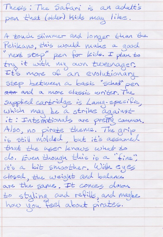
So which one is the best? Like most playground showdowns, this one may come out a draw (no pen pun intended.) The Safari is more grown-up, but also simpler. The Pelikano Junior has a number of well-thought-out details making it suitable for the classroom, but its styling may raise an eyebrow or two in the boardroom. But if you can get standard cartridges -- all the big box office stores around here carry them -- you won't be far from a refill and they last a long time. I suspect they have room for a converter, too.

Safaris have swappable nibs, so as a "gateway" pen, it's got a lot more flexibility and expandability out of the box. It's rare to hear a Safari owner not recommend them to pen newbies.

In the end, I think it comes down to budget and personal preference about styling. Unlike the disappointing Zebra V-301, both of these handle great, write smooth, and can survive life in a pocket, backpack, or briefcase.

Which would you choose?

Friday, February 7, 2014

Yellow Fellow

Although this week was pretty rocky, it ended on a high note.

Shipment #1

After over-analyzing things on the pen front, I went ahead and picked up a Safari, to use up the stockpile of cartridges I have around. The Pilot carts are impossible to find around here, so they will resurrect my existing steel Pilot pen when I need a businesslike pen at hand.

The Waterman ink is evidently the renaming of their old "Florida Blue" color. Safe for vintage pens like the new green fellow sitting in the pen box, waiting for me to schedule a new sac-and-shellac surgery.

The real treat, though, is in the box. Is anyone else reminded of a comb feed? Those slits are pretty stylish in a contemporary-design way. Plus, it lets you peek inside...

Lamy Safari

"Sedate" is not a word I'd use to describe the Safari. Having grown up with Lego and still having *cough* a few bins of the stuff in our shed for the kids *cough cough* I actually like the primary colors and the ABS plastic shell. There's no mistaking that this is an inexpensive writing instrument, but that doesn't mean it's cheap. Little touches like the molded grip section and that chunky clip mean this is a pen meant to be used by little hands and big, and taken out in the world, not left on a shelf.

The cutout window is a nice solution to the problem of seeing how much ink is left, and the cartridges are generously sized, to say the least. I opted for the fine-sized nib here, since this will probably be a knocking-around, toss-in-the-pocket pen, and need to be miserly with the ink. A little testing shows it to be a "wet" writer, not scratchy. I'm looking forward to putting it in rotation, and since it's plastic, it can happily live in the flower frog/pen holder on my desk where it's close at hand.

Speaking of yellow, and re-purposed pen storage, this brainstorm hit me at the thrift store:

Pen trays for the budget minded

It's supposed to be a tray for making ice cubes for your water bottles -- narrow, to fit in the neck, you see. The perfect size for pens, though. It's currently modeling my assortment of cheapo Sheaffer calligraphy pens, the steel Pilot, and that red no-name one that decided to take regular ink-poos on my fingers. It's being punished.

Next time: flirting with tetanus!

Wednesday, February 5, 2014

His Nibs

Life for the past five days or so has been a whirlwind as my older child and wife both came down with a nasty respiratory flu, leaving me ostensibly in charge of meals, laundry, homeschooling, and also juggling work and starting our youth team's track practice. I've lost a few days in there, but as my beloved is slowly getting back to health -- and the youngest child spikes a fever, sigh -- I'm getting my head up again, and going "Holy crap, it's February already" and "it's ITAM, I should type something."

Today was my first day back in the office after that unexpected bout of home-care, and while I try to fend off the coughing from my coworkers* I made the pen decision that got postponed. The final purchase was... a Pelikan M205! As much as I covet the vanishing point, I realized that I'd be sad if I didn't check out a pen that's so highly praised, that requires no fuss to refill, and is designed to be modular -- don't like the nib? Unscrew it an pop in a new one. That's pretty awesome.

It should be here in a week or so, and I had enough left over to pick up a Safari, too. Also highly praised, it meets my criteria for being durable, carryable, and not so precious that I'll freak out if it's dropped (cough Speegle cough.) Also, when our local Borders books was on the verge of closing down, they had about a few boxes of Lamy cartridges in a clearance bin that have been waiting patiently for a pen to juice up. I'm just as excited about this as the Pel, honestly.

Finally, when I managed to get the household stabilized enough this weekend to run out and pick up some groceries, I swung through a consignment store that's dangerously close to my house. Most of the wares are not to my taste or wildly overpriced but what's that down there in that cabinet?

Sheaffer jade flat-top detail
Shiiiiiiny

So, to recap -- set out to pick one pen, wound up with three. Seems about right.

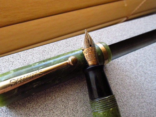
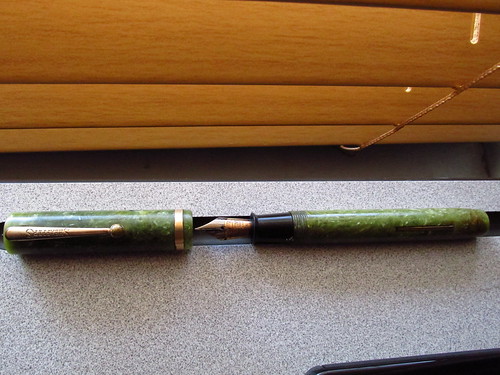
This is an old Sheaffer "flat top" Lifetime pen. "Old," since it's likely from the 1920s-1930. "Flat top" because, well, the end of the cap is flat:

Sheaffer jade flat-top

It's also ink-stained, noticeably brassed in places like the knob on the clip, and the sac literally tore in my hands. What was once a bright green "jade" color is now a mottled pea-soup, which are all known issues with these guys. I also really, really like it. It's grown on me, and with a coat of the same carnauba wax that's so effective on enameled typewriters, it's regained some of its old lustre, if not its color. And soon: it'll have some friends to join it.

* Seriously: stay home if you don't feel well. There are no medals for being the office martyr to the plague. Stay the hell home. I get completely germophobic at this time of year.

Monday, January 27, 2014

Daily doubts

(Warning: pen geekery ahead)

20140127 pencast

I did turn up a Pilot Knight that I'd forgotten about, and realize that a Parker Latitude has gone missing. Hmmm. Also, various Sheaffer calligraphy pens dating from the time when my ambitions outweighed my skills or patience, an all-too-frequent happenstance these days. I realize that I've tended towards pens that use the "standard" (international-end) cartridges, since I have a couple of converters around that fit and will let me use bottled ink. The pens that have their own proprietary systems -- Parker, Pilot, Sheaffer -- tend to get kicked into the back of the drawer once their supplied cartridge goes dry.

So, I know for certain that I'll be getting some blunt-tipped syringes to allow me to refill old cartridges, and/or pick up brand-specific converters to let me press these orphans into use. But that's the only amount of certainty I have right now. At the moment, I'm waffling mightily among the Lamy 2000 and the Namiki Vanishing Point, though the VP may win between these two, based purely on the descriptions of feel. The other one in the running is a Pelikan M200 or 205, because oooooh, piston-fill and oooooh, swappable nibs and so on. You can't beat the ease of refilling a piston-fill pen, with no mucking around with cartridges or converters or syringes or any of that.

Wednesday, January 22, 2014

Daily Carry?

20140122 pencast

Much as I love the character that my current dailies have -- brassing and so on -- there's no mistake that they were made cheaply as part of a gift set, the writing-instrument equivalent of giving someone a duck-shaped wickerwork basket full of decorative soaps*. I'm leaning towards the Safari for its range of colors and its low cost: I won't feel too bad about letting one knock around in my bag or tossing it in my jacket pocket. But I'm not set on the idea by far.

Speak up, pen-nuts. I know there's a few in our number. At worst, I can blow everything on Noodler's ink.

* This is the standard baseline in our household for comparing gifts given unthinkingly to another person. "Sure, it's bad, but is it soap-in-a-duck bad?"

Monday, January 13, 2014

The Personal Touch

20140113 pencast pt1

20140113 pencast pt2

20140113 pencast pt3

We're trying various things at home, including having my daughter type her Christmas thank-you notes on the same Smith-Corona she used on last year's Typewriter Day. That seems to be a big help, since she can focus less on forming the letters and the mechanics of holding the pen properly, and can pause to check spelling before she commits the letters to the page. We'll see if it becomes part of our homeschool toolkit. We also picked up a Pelikan "Pelikano Junior" pen for her to try with her handwriting time. It has a grip that subtly enforces the triangle grasp.

It's interesting to me that we're combining "old school" tools in her schooling, along with modern options like handwriting-practice apps and a Franklin speller. Very holistic-Californian, no?

Wednesday, August 21, 2013

The Most Dangerous Time of the Year

I share Little Flower Petals' weakness towards office supply stores, and now, as schools are starting back up, it's an even more dangerous place to walk into. Not only are the usual school-related items marked down, but in the preparation for what's the largest sales days of the year -- judging from the length of the checkout lines -- the staff have been required to find space for all the wares, meaning a stem-to-stern clearout of the shelves.

Don't get me wrong: I would be thrilled if we had a decent independent stationery shop here in the suburbs, and not the outpost of a major corporate entity. "Suburbs" and "independent business" do not typically overlap, though, so one must make do. The up side is that the larger stores tend to carry stock much broader and generally weirder than a small shop. I've been using this store to ship out typers from the great clear-out project (still going!) so I've of course found myself wandering back to the "Clearance" tables hiding in the back of the store, heaped with the residue of past stocking mishaps. I was in again yesterday, for a project I'll discuss in a moment.

During the shipments, the store had found -- somewhere -- boxes of old pin-feed computer paper. You know the sort, maybe, if you're of a certain age. This is the kind of paper with tear-off strips running down both sides, and perforations between the pages. It dawned on me too late that this would be a suitable BAROP substitute, being both in its own container and pre-cut for easy pagination after typing. The store had a couple of boxes of paper for a while at what I assume was a good price, but they appear to have been snatched up at last, no doubt by some local business still keeping their dot-matrix printers alive. I suspect the DMV.

Fresh trinkets made it out to the tables, though, including a heavy-duty pencil pouch with a large pocket in the front -- for a calculator, maybe? Always handy to have around, I decided, and chucked it into my basket. I also found some nice embossed note cards which will get added to the family collection of potential thank-you letters, and a pair of rectangular Moleskine-brand pencils that formerly carried a Moleskine-brand price. And then, high on the fumes of savings, I went wandering the regular aisles.

Theoretically I was in the store to have a ream of sugarcane-based paper cut and bound into notebooks to keep by my phone and keyboard at work, and at home, and anywhere else I need a stack of fountain-pen-friendly paper out and available. While waiting for the binding, though, I got into trouble in the clearance table, and then wound back through the pen aisle to discover that Bic has hopped aboard the Disposable Fountain Pen Bandwagon with Pilot. They're now selling their own plastic-barreled pens. I usually see these as a challenge -- they say they can't be refilled, but is that true? The Pilot Varsity makes a very respectable eyedropper pen, for example, once you learn the magic spell: pull out the nib and feed, rinse, refill, and re-use. It's a very cheap way to get into nicer pens and inks without a lot of fiscal outlay. One of these days, I'd like to treat myself with a vanishing-point pen, but I'm afraid I'd always be fussing over it. It's hard to fuss over pens that cost $5 for two.

So, in the days to come, I'll do a disposable pen compare-and-contrast blog entry, testing out the new sugarcane paper pad as well. And maybe that will keep me away from the office supply store for a while... or until the next typer gets adopted.

Saturday, October 13, 2012

I Love October

October planning

I do enjoy this time of year: the seasons (such as they are) are changing, and we seem to be breaking from the hot days, moving into cloudy, cool weather. We've even had the first rain showers of the fall. I'm doing my usual overplanning NaNoWriMo insanity -- writing a sequel to One Last Quest -- and have just had the inspiration that might tie together the main bits of plot that I've been woolgathering in my various scattered notebooks. The pile of index cards is growing... a story is being born.

It's a great feeling.

Thursday, May 6, 2010

That's What She Said (Wrote)

Brainstorming supplies

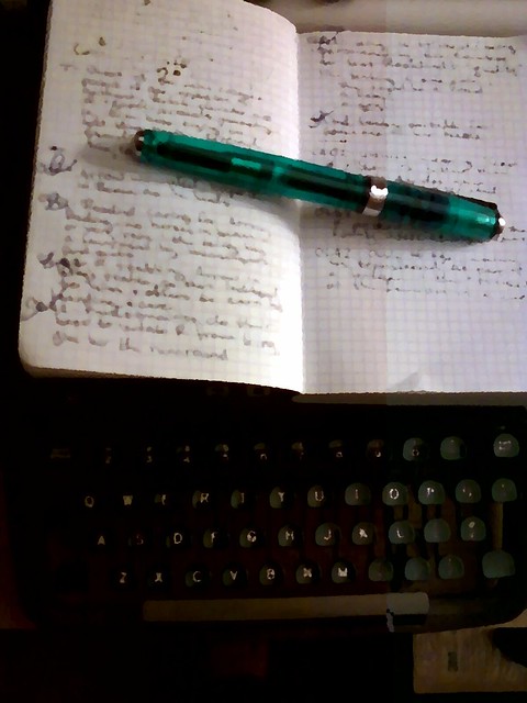
I don't know whether this is one of those freaky typosphere convergences, or another tribute to the utility of paper and pens, but today's post on Little Flower Petals was spookily similar to what's become my own standard practice: namely, using a composition book to jot down all manner of ideas. I've talked about this before, in using a small Rhodia pad for on-the-go capture, and I still tote that little guy around with me on walks and to the kids' sporting events, as it's the ideal form of pocketable pen-friendly paper. But lately, I've been using a composition book by the bed, and trying to make myself write at least one thing in it every night.

Composition books are great: they're cheap and spacious and a comfortable lap size, and the stiff covers are suitable for holding a reading light: good for those of us jotting late at night. I'm using Staples "eco easy" line of books, which are made from bagasse paper (remnants from sugarcane production.) It's a light, slightly crispy paper that also takes fountain pen ink exceptionally well, especially for the price. My barely-awake ramblings in the notebook get transferred to index cards on one of the typewriters: usually Norma Jean as she's an elite machine, so I can pack more words per card as needed.

I have a number of works-in-progress in mind when I make notes, and put an abbreviated working title next to the notes which gets transcribed onto the cards (makes it easier to sort out later.) Currently, I've got nine works in various states of woolgathering, including my 2009 entry, and a first draft that I started writing just to test out a restored typewriter (and which will need a do-over, since I got stuck and abandoned it.)

With all the hype about the latest greatest iThing and how it will revolutionize media consumption, it's very satisfying to find rewards in low-tech acts of media production.

Wednesday, March 31, 2010

Orange You Glad

Chalk one up for the Twitterverse, for through that I found out about Exaclair offering an ink-and-paper-sample giveaway over St. Patrick's day. Specifically, a sample of either green or orange ink from J. Herbin plus a bit of Clairfontaine paper to try it on. I've yet to get orange ink all over myself, so that's the one I requested, and joy! it arrived today...

J. Herbin "Orange Indien" + Clairefontaine cahier

First, let me say that I was expecting maybe a little plastic vial of ink and a couple of sheets of paper, stuck into an envelope. What I was not expecting was the arrival of a well-packed box containing what you see above: a 30 mL bottle of ink and a 48-page 3 1/2" x 5 1/2" soft-cover cahier. So just after the unboxing I'm already experiencing epic win.

Luckily for me, the win didn't stop there. This is a very well-behaved ink: I've swabbed it on a small Canson lined notebook, on a Black 'n Red spiral notebook that I use for work, on my small Rhodia #11 pad, and on a composition notebook from Staples made of bagasse paper (sugar cane remnants.) All four are known to be fountain-pen-friendly, and they did not disppoint: only on the Canson did I detect slight feathering from the swabbing, and none of papers even hinted at bleeding through. I torture-tested the Rhodia pad by swabbing back and forth over the same area for a while, and except for some wetness-induced curl, it behaved perfectly. Finding the good combination of ink and paper can be tricky, but no tricks are needed here.

The color in the bottle is almost iodine-like -- the resemblance was particularly strong on the swabs and (sigh) on my skin -- but on the page it is far lighter. This ink is aptly named -- Orange Indien -- for it puts one in mind of saffron or curry: it is certainly orange, but not neon colored. It's quite readable on a page by itself, which was one of my concerns after I selected it: fountain pens make poor highlighters, as the ink is water-based and will gladly smear any water-based ink they cover. My super-swabbing test on the Rhodia pad was over a section I'd written in ballpoint, which is oil-based ink, and there was no smearing or blurring as expected. But I would not devote this ink to life as an accent color. It dries a bit more slowly than the my everyday inks -- Quink Black and Waterman Florida Blue -- but perhaps because of this and the color, the dried ink exhibits the nice shading characteristics you expect when you think "fountain pen." And unlike other brightly-colored inks I've used, there doesn't appear to be any little "clumps" of dye. I'm going to leave it in the Parker that I loaded up to see how it behaves longer-term.

Overall, I'm very pleased with this, and send special thanks to Karen Doherty at Exaclaire, Inc. for sending these along. It was a pleasant surprise, made all the more pleasant by the high-quality ink and paper inside.

Tuesday, January 19, 2010

Eye Exercises

Heading out into the weather with a camera in hand? Here's five practical tips to keep in mind...

Tip #1: Remember the "Rule of Thirds"


This is a classic guideline for composition. Imagine that your frame/viewfinder/LCD screen is divided into thirds horizontally and vertically, and try to put the focus of your picture in one of the intersections, or place a line (of objects, a horizon, a tree) along one of the imaginary lines.

Most modern cameras put their focus mechanism right in the center of the picture, which might encourage you to take all center-framed shots of your beloved, badly-drawn cat Fluffy. Resist the temptation! It's usually possible to lock the focus on a subject by pressing the button halfway down, then re-frame the shot as you hold down the button and then fire the shutter.

Photo tip #1: The Rule of Thirds

Tip #2: Survey the Frame

As you're setting up the shot, look all the way around the frame. Sure, Fluffy is adorable, but that garbage can behind him is decidedly less so. Best scoot over a bit and take the shot from a different angle. How many times have you see tree-branch antlers growing out of someone's head in a photograph? Just say "no" to turning your relatives into jackalopes with this simple step.

Photo tip #2: Survey the Frame

Tip #3: Count your Subjects

Humans are natural sorters and pattern-recognizers. Taking a photo of two subjects (especially similar ones) automatically invites comparisons between the two, and tends to make the picture "stable" to look at. With three subjects, though, the eye and brain hop around among them. Odd numbers of subjects in a photo generally make it more dynamic to look at.

Photo tip #3: Count Your Subjects

Tip #4: Film is Cheap!

If you're on a once-in-a-lifetime trip, don't squander the film. The cost of having a second, third, or fifth shot developed is far less than the cost of trying to recreate that moment in time. Take your "postcard shot" of landmarks, and then move around and get a few more angles. And when you're taking portraits, always get "one for luck" in there. (More if you're photographing kids.) Afterwards: edit, edit, edit. I shot something like seven rolls of film in a week at Disneyland, just to get about 30 "good" shots.

Photo tip #4: Film is Cheap!

Tip #5: Break the Rules!

Anyone who tells you there's only one way to shoot, or one brand of camera to use, or is zealously in the film-is-dead or digital-is-evil camp and can see nothing else is not worth your time. Photography is about keeping your eyes open, getting a perspective on the world, and documenting it for yourself or others to enjoy. Anyone that's making it less enjoyable for you is a bum. None of these tips or any of the hundreds of other bits of advice out there are must-dos, so do what you like, discover what works for you, and go shoot something.

Friday, December 12, 2008

Gold, Frankenpen and Murray

Murray the pen Meet Murray

In lieu of any other identifying marks, I've decided to name this no-name pen Murray. Like too many things in my life this year, Murray came by way of shopgoodwill.com. I'd been looking at desk calendars for some time, as a little extra retro-junk to litter up my workspace. I'd lost out on a ticky-tacky World's Fair model, but the fates provided, and Murray in all his brassed glory is now enjoying his retirement in California.

Why "Murray?" A little quick research on the nib (marked "Velvet Point 6") shows this pen to be what's charitably classed "third-tier" by those in the know, a kinder way of saying "a step above junk." Still, I'd been also meaning to get a desk set at some point, and this fit the bill. Murray's nib was broken ages ago -- it's only got one tine -- but after careful application of force and swearing, I was able to remove the old nib and feed, and shove in replacements from a cheap gold-nibbed calligraphy set I had picked up last year, thus converting this into a Frankenpen. "Murray" seems like a pretty average name for an otherwise average pen, even if he has had some work done.

I figure this pen sat on the desk of some middle-aged, Midwestern*, middle-of-the-road manager, maybe a thank-you gift for years of uneventful service. The finish on the date knob is brassed away from patient years of counting off the days. It's not a flashy set and yet... I like it. We have a lot in common, Murray and I: generic heritage, utilitarian without being flashy, just trying to be ready and useful without leaking everywhere.

* Don't take offense, Midwesterners. The pen came from Illinois. This wasn't meant as a pejorative.