Showing posts with label the timeless utility of paper. Show all posts

Saturday, November 21, 2015

Suede Recap: The Nano Challenge

We're into the final ten days of NaNoWriMo, and I've been averaging around 1700 daily words, right on par for finishing on time and on target with the words. I've already had to bench a cheap nylon ribbon on account of drying out, and just now, I finished re-wrapping the platen in another sheet of suede-finish/velour-texture paper from the craft store. I've been using in it lieu of a backing sheet this year, and back before Nano got going, wrapped the platen of my main machine in tape, sticky-side-out, with a cut sheet of paper adhered to it.

The Good:
  • It's super-grippy, and seems like a quick and cheap solution to slippery worn platens. I'm running about 6-10 pages per day through the machine, and not a one of them has come through crooked. I've never had this kind of luck with a backing sheet.
  • Still an incredible bargain, especially when you coupon-stack and pick numerous replacement sheets from the craft store. Plus, it comes in zebra print which I was not quite bold enough to try (yet.) The color really dresses up the machine, which is in desperate need of it. Royal knew how to make them ugly.
The Bad:
  •  It is, fundamentally, paper, and as much as I want to pretend it's something more durable or cushioned, it's no replacement for a fresh grippy platen. The one on the Royal is a little rough from many past years in the Typewriter Brigade (this is year #8) and it's now featuring noticeable vertical banding along the rubber from all the impacts. Even with a backing sheet or two, this platen works hard.
  • Applying this is still tricky, and getting the seam flat where the ends of the paper meet requires either three hands or a better grasp of geometry. In theory, one should be able to cut right to size. In practice, I just wrapped-and-trimmed. It shows.
  • In time, my rough-and-ready tape job showed through. Not by wear in the paper, which held up admirably, but in the wrinkles from the tape surfacing on the paper itself, leading to uneven type. As in many things: take your time and take care.
The Mystery:
  • Is the fancy paper more cushioned? At least at first it seems like it is. Repeated strikes over a few weeks, though, hammered the surface into oblivion, leaving only the area outside the margins free of problems.
  • Has the platen suffered any less damage than it would without paper at all? I don't know. As I subscribe to the backing-sheet-always school of typing, I don't think it's a bad thing. It's made it over 60 years now. Any TLC is probably worthwhile.
The Photos:

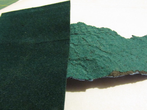
I'd hoped to peel the old sheet off somehow and have it laid next to the new one for comparison. This did not happen. Since I'd practically covered the platen in tape, the only way to remove the paper was to tear and peel in a long spiral.

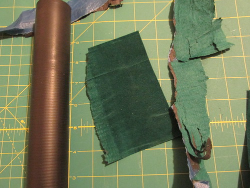
Here you can see the platen on the left -- note the banding from years of typing, some of the paper on the top (the blue-tape side), and fragments that I managed to salvage. Can you tell which part of the green paper was outside the margins?

Velour-wrapped platen: unpeeled

Here's another comparison of original texture versus the three-weeks-in side. You can see how bad the worn surface was wrinkled at the end. I had wrapped the platen like a barber pole in tape, spiraling down it completely.

Three weeks of daily typing took their toll

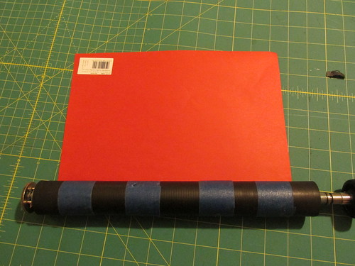
The replacement going on. I backed off on the tape this time, going for four loops instead of a complete surface. Nothing is stuck to the rubber of the platen: the tape is fastened only to itself on the ends and slides freely.

Preparing wrap #2

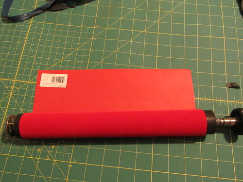
The new red wrapper, pre-trimming.

Covered in red

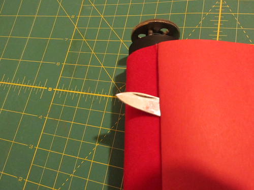
I creased along the edge where the paper meets itself, and then used a sharp pocketknife to slice down the crease to remove the excess. It's still not as good as computing the actual size or the paper needed. There's still a bit of an overlap in the final product, but it's less than my original.

Trim to fit (mostly)


This whole experiment has me looking at other sheets of material at the craft store, too -- nylon sheets, maybe actual felt instead of faux-felt... upholstery fabric? The possibilities are endless. I don't know if it has much real merit beyond short-term writing projects like Nanowrimo, or maybe the occasional photo shoot, but I'm still happy with the results.

Now, if someone just sold a wrapper that made my plot better...

Tuesday, December 2, 2014

Rhodia Paper Project: Weeks 1-5

The fine folks at Exaclair, Inc. are the US importers of Rhodia paper products, and being the slavering fanboy that I am, I was very pleased to see them running the "Rhodia Paper Project" from their blog, whereby other fanboys/fangirls could sign up to get samples of their various products mailed to them on a weekly basis to test out, in return for comments and feedback.

This had the back luck to happen just before NaNoWriMo kicked off this year, and although I've been diligent about signing up each week via Rhodia Drive, I've been pretty slack about testing or commenting, because, you know, noveling. I'm digging out after my win now, and am making up for lost time...

Week 1: Your choice of grid

The contenders:

  • Rhodia Ice: white/grey/graph
  • Rhodia 80th Anniversary ivory/grey/graph
  • Rhodia Classic white/blue/graph
We start off by trying out the various forms of grid colors. I personally like using graph-style paper if it's available, especially for note-taking and NaNo plotting since I have terribly slop handwriting, and tend to drift all over without guidelines. I've got some notebooks old enough to have bluish grids, which I think Rhoida has since replaced with a violet ink (more eco-friendly sources, I gather.) My go-to ink color is blue for just about everything -- easy to tell when it's been photocopied -- so this week was about testing which ink I liked best against the three different grids and the paper colors.

I was predisposed not to like the ivory paper, which seemed a little faded or even dirty compared to the clean white of the other two. Maybe it's the grid talking, but it seems like the grid shouts "professional and serious" and the ivory paper says "quaint drawing room." I am also surrounded by white office paper all day, and use it in my meeting notebooks, so again, bias.
  • Rhodia Ice: white/grey/graph 
This was my favorite of the three samples, by far. The gray grid is very light on the paper, clear enough to see, but not clashing with any of the inks or pencils that I tried on it. The paper is the lighter of the two weights supplied (90g vs. 80g) but this is not paper you're going to send letters on, most likely. The grid says "serious" to me, and would be appropriate in a lab or classroom.
  • Rhodia 80th Anniversary ivory/grey/graph
My least favorite sample of the three, though the grid is subtle, and against the ivory paper, looks almost brown. I can't get past the color for this application, though. Clearly this is a personal moral shortcoming.
  • Rhodia Classic white/blue/graph
Second choice, and the one I already own in different sizes. In comparison to the "Ice" product, the lines are very visible, and especially when using blue ink -- the grid tends to clash more with my writing instead of fading invisibly into the background like the gray.

Week 2: Take a letter

The contenders: 

  • Clairefontaine Graf It
  • G Lalo Stationery (white)
  • Clairefontaine Triomphe
The second week is all about stationery, so the samples are unlined and plain. This is what you write your post-holiday thank-you notes on, and in that context, everything I said above pretty much goes out the window here. There really is a time-and-place for various papers, something I've not given much thought to before.
  • Clairefontaine Graf It 
Plain white, and with a slight, subtle texture on the surface. This is nice stuff, 90g, and was grippy enough to use pencil -- some of the regular Rhodia paper has a slickness that's welcome with fountain pens but disconcerting with a pencil. You need a little friction, and this has it. It reminds me very much of the bagasse (sugarcane waste) paper that I use for NaNo typing, with a little toothiness, but heavier than cheap old office paper. I would not be sad to own a pad of this with some ostentatious monogram in the corner.
  • G Lalo Stationery (white) 
Though this says "white," compared to the other two samples, it's a very light cream color. It has visible horizontal texture lines to it, and a subtle vertical line (watermark?) every 3cm. I was predisposed to dislike this entirely, expecting it to be grabby, toothy, and hard to use with my preferred pens. I'm pleased to say that I'm wrong on all fronts. Pencil behaves nicely even when writing lightly, and fountain pens give just the right amount of feedback. This is languid, letter-writing paper, and the color for this application is perfect. The clear winner.
  • Clairefontaine Triomphe
Of the three, my least favorite, though it's like trying to choose amount three very-good things. The same weight as the Graf It, but utterly smooth, like Rhodia pads, and as such, badly-behaved with pencils. Fountain pens skate all over the surface as expected, and the gel rollerballs I was testing with were so quick it felt like driving on ice. I would not say no to this if it were foisted on me in a dark alley, for sure, but if you're going to do correspondence, treat yourself and the recipient to one of the other two.

Week 3: The journal selection

The contenders:  

  • 5×8 Webnotepad Lined, (same as Webbie paper)
  • 6×8 Lined R
  • 6×8 Lined Rhodia 80g 
Week three is what I think of as the "journal selection." It's an odd size paper for my own needs, which tend toward the letter-size or A4 notebooks. These are all lined, with big broad spaces. Lots of room for inmost thoughts, I suppose. I don not have a rich inner life that requires documenting.

  • 5×8 Webnotepad Lined
  • 6×8 Lined R
 A tie this week, and mainly because the difference falls between if you want a little extra width as in the "R" pad, or rounded bottom corners as in the "Webnotepad." The "R" is top-perforated, like many of their notebooks, so it's entirely possible this is meant for less permanent writing. The other is not perforated -- the sample has clearly been torn out of a pad -- and if you're keeping a journal, that seems like it would be of more use to you. I have an unlined Webbie that accompanies me to back-to-school nights, kids' sport meetings, and other real-life/non-work situations where I need to jot down notes and numbers, and don't want to lose them. Both pages are 90g ivory, with the grey lines, and again, for this use, I can see it being superior to the white-with-blue.
  • 6×8 Lined Rhodia 80g 
Another choose-among-very-good-things, but this has a large red margin rule down the left side -- "large" here meaning 1 1/2" of space, which is a quarter of the page width. This feels really wide, and if you're even the tiniest bit OCD (ahem) it may bother you that so much "good" paper is going to waste over there, especially if you grew up with the cheap filler paper and spiral notebooks like I did, with the margin line dancing dangerously close to the holes punched in the paper.

Week 4: Colorful students

The contenders: 

  • 1 sheet of the 8×11″ Clairefontaine Pastel Graph paper
  • 1 3×5″ Exacompta Pastel Index Card
There are times when I regret not being a student again, because I've since learned quite a bit about note taking, organization, and the excitement of a well-stocked university bookstore. Then a come to my senses and remember the terrible food, crushing debt, and general lack of sleep, and am glad I'm gainfully employed instead. This week isn't so much a comparison as just a taste of products that I would totally send to student-version-me, once I get that time machine worked up.
  • 8×11″ Clairefontaine Pastel Graph paper
Normally I could give a pass on pastel paper, but this is pressing all my organization-nerd buttons: bound in a spiral notebook with perforations for easy removal. Heavy 90g paper with a grid on both sides. My sample was a light blue sheet, and the normal Rhodia purple grid looks fine against it. There's an index tab cut out of the side for indexing the notes, and I'm guessing this comes in a multi-subject notebook offering many sections of different colors. The grid is ideal for math formulas and structured notes. I wish I would have used graph paper all through my computing classes.
  • 1 3×5″ Exacompta Pastel Index Card 
Actually, two in my envelope: one green, and one yellow. Unlike cheapo index cards, the grid is on both sides, they are heavy paper (205g), and of course, pen-friendly. I used index cards to remember (i.e., cram) everything before exams. Past-student me would have certainly matched up the cards to the notebook colors, just because.

Week 5: Size does matter

The contenders: 

  • No. 8, (3 x 8 ¼”)
  • No. 10 (2 x 3″)
  • No.16 (6 x 8 ¼ “)
  • No. 19 (8 ¼ x 12 ½ “)

The best thing about Rhodia products -- aside from general pen-compatibility -- is that there's a size for every purpose. The worst things about Rhodia products is that there's a size for every purpose. The choice alone can be overwhelming, and in those rare cases when I am in a retail store that actually sells them, just spinning through the rack gets me a little dizzy... as in I could totally buy ten of these and use them for... I don't know what...

Like the previous week, these don't lend themselves to being compared with one another. They are all lined in violet on 80g white paper. The largest sizes have the same wide margin, and all are top-perforated.
  • No. 8, (3 x 8 ¼”) 
If you don't have a ruler handy, think "bookmark size" or "shopping list size." I own a gridded variant of this, and I use it for both purposes. It's just wide enough to get a decent list written down, and plenty long for use as a notes/bookmark. Consider using one to keep characters straight in your next Russian novel.
  • No. 10 (2 x 3″)
Almost comically small, just a little larger than half a business card. Small enough that you could keep one each in your pocket, bag, car, desk, stuck to the fridge on a magnet, glued to the dog, etc.. The lines are pretty well spaced apart given the amount of paper you're looking at here. Maybe for composing tweets offline? I struggle to find a use for this, other than as the ultimate tiny notebook when you need to jot down some critical fact, like, to pick a random example out of the air, the name of a piece you heard on the car radio, forgot, and then have spent a decade trying to remember. Just for example.
  • No.16 (6 x 8 ¼ “) 
See Week 3 for thoughts on this size. Tucked in with other lined samples, I can see this being most useful as the by-the-phone doodle and message pad, maybe the tote-to-a-meeting pad where you don't want to commit to actually taking a large number of notes, but don't want to get in trouble for staring at your phone the whole time, either. I personally find this size just a little too small for my writing needs at work, and too big to carry around casually.
  • No. 19 (8 ¼ x 12 ½ “) 
Ah, now we're talking. This is A4 sized, a little narrower and a little longer than a US Letter size, and the one I'm used to for my own meeting notes (I'm working through a backlog of old Black n' Red A4 notebooks.) The left margin is just as wide, almost wanton, but at least in the larger format, it can be used to call out points of interest: flagging to-do items is an obvious use case for me. I do like bringing paper to meetings, and having a whole year's worth of meeting notes in one place has proven invaluable to me, since I can flip back and reference old notes. The Rhodia is in a top-bound orientation, though -- like a legal pad -- and that I would find less useful than the spiral-bound books I use now. Of the four samples, though, this one has the most utility for me, and I could get past the top-binding pretty quick. I suspect the paper would hold up to disc binding very well if I needed to make an archive notebook. A future sample is slated to include their "meeting book" paper, which looks to be just about perfect. I think I'm ready to graduate beyond the simple lined-only books in the (sigh) five years when the Black n' Reds run out. Or sooner, if they meet an "accident."

Wednesday, August 21, 2013

The Most Dangerous Time of the Year

I share Little Flower Petals' weakness towards office supply stores, and now, as schools are starting back up, it's an even more dangerous place to walk into. Not only are the usual school-related items marked down, but in the preparation for what's the largest sales days of the year -- judging from the length of the checkout lines -- the staff have been required to find space for all the wares, meaning a stem-to-stern clearout of the shelves.

Don't get me wrong: I would be thrilled if we had a decent independent stationery shop here in the suburbs, and not the outpost of a major corporate entity. "Suburbs" and "independent business" do not typically overlap, though, so one must make do. The up side is that the larger stores tend to carry stock much broader and generally weirder than a small shop. I've been using this store to ship out typers from the great clear-out project (still going!) so I've of course found myself wandering back to the "Clearance" tables hiding in the back of the store, heaped with the residue of past stocking mishaps. I was in again yesterday, for a project I'll discuss in a moment.

During the shipments, the store had found -- somewhere -- boxes of old pin-feed computer paper. You know the sort, maybe, if you're of a certain age. This is the kind of paper with tear-off strips running down both sides, and perforations between the pages. It dawned on me too late that this would be a suitable BAROP substitute, being both in its own container and pre-cut for easy pagination after typing. The store had a couple of boxes of paper for a while at what I assume was a good price, but they appear to have been snatched up at last, no doubt by some local business still keeping their dot-matrix printers alive. I suspect the DMV.

Fresh trinkets made it out to the tables, though, including a heavy-duty pencil pouch with a large pocket in the front -- for a calculator, maybe? Always handy to have around, I decided, and chucked it into my basket. I also found some nice embossed note cards which will get added to the family collection of potential thank-you letters, and a pair of rectangular Moleskine-brand pencils that formerly carried a Moleskine-brand price. And then, high on the fumes of savings, I went wandering the regular aisles.

Theoretically I was in the store to have a ream of sugarcane-based paper cut and bound into notebooks to keep by my phone and keyboard at work, and at home, and anywhere else I need a stack of fountain-pen-friendly paper out and available. While waiting for the binding, though, I got into trouble in the clearance table, and then wound back through the pen aisle to discover that Bic has hopped aboard the Disposable Fountain Pen Bandwagon with Pilot. They're now selling their own plastic-barreled pens. I usually see these as a challenge -- they say they can't be refilled, but is that true? The Pilot Varsity makes a very respectable eyedropper pen, for example, once you learn the magic spell: pull out the nib and feed, rinse, refill, and re-use. It's a very cheap way to get into nicer pens and inks without a lot of fiscal outlay. One of these days, I'd like to treat myself with a vanishing-point pen, but I'm afraid I'd always be fussing over it. It's hard to fuss over pens that cost $5 for two.

So, in the days to come, I'll do a disposable pen compare-and-contrast blog entry, testing out the new sugarcane paper pad as well. And maybe that will keep me away from the office supply store for a while... or until the next typer gets adopted.

Saturday, October 13, 2012

I Love October

October planning

I do enjoy this time of year: the seasons (such as they are) are changing, and we seem to be breaking from the hot days, moving into cloudy, cool weather. We've even had the first rain showers of the fall. I'm doing my usual overplanning NaNoWriMo insanity -- writing a sequel to One Last Quest -- and have just had the inspiration that might tie together the main bits of plot that I've been woolgathering in my various scattered notebooks. The pile of index cards is growing... a story is being born.

It's a great feeling.

Friday, April 13, 2012

WIP It Good

Bob and Mike and I were having a discussion1 on the Twitter yesterday, kibitzing about editing, and hating it, and avoiding it, and how each of us does manage to do it in those rare times when we're inclined2. We pledged to swap photos of our works-in-progress, so here goes...

Manuscript
THUD

All hail the mighty tome. This hunk of dead tree3 is my 2011 manuscript from NaNoWriMo, currently entitled The Balled of Congo Willy, a sort-of-lighthearted romp through middle age, ennui, death, and video games. Doesn't it look tidy? That's because I have children, and I learned the hard way that a large stack of loose paper sitting around is an invitation to unstack it by whatever means necessary.

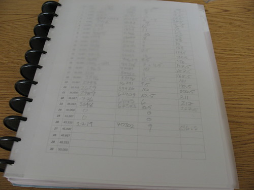
I use the Rollabind system4 to keep all the sheets together, though I could just as easily use a 3-ring-binder system. This is a bit more compact, since you can fold the page back like a spiral-bound book. Cover material is salvage from old reports at work, and the first page is my page-and-word count checklist. Looks like I have around 240 pages to edit. Whoo boy. Better get started.

Page numbering
Start at the beginning, and when you get to the end: stop

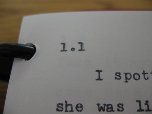
Because I have all this paper sitting around over the course of November, I had to come up with A System, because I enjoy that sort of thing, and because I know I need to hit six to eight pages a day during NaNo. These are my page numbers: day.page As you flick through the draft, you'll see 1.1, 1.2, 1.3, etc., and then 2.1, 2.2, 2.3, etc.. I know that normal people would just use normal page numbers, but I'm. Not. Normal.

A lot of ink spilled
Bring out the pens

Oh yeah, baby, that's what I'm talking about. Bring that nib over here.

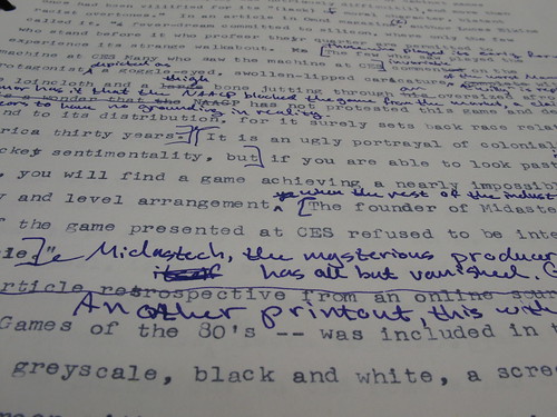
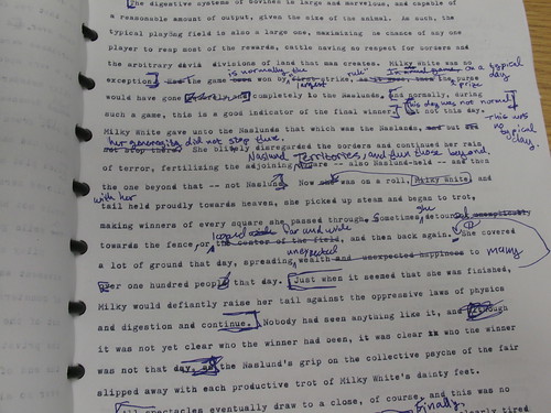
Drawing right on the draft. Why else would you double-space? This year I might even use the triple-space option to give me more room. I tend to move a lot of stuff around, referencing earlier parts of the draft or leaving notes for the rewrite. Grammar gets cleared up here, but spelling waits until it goes digital.

Reworking, rewriting, removing
No one will be seated during the dramatic cow-pooping scene

Despite all my pre-planning and card-making and muse-baiting, there's always a scene or section that takes me by surprise. This year it involved a game of "Bessie Bingo" that goes horribly, horribly wrong. This scene is pretty crappy right now5, but even the "good" scenes look like this in the MS: ink everywhere, passages excised or moved, but nothing obliterated in case I want to go back and mine it later.

So, that's the WIP so far. I've actually broken my own system to read the last third of the draft without edits, as things resolved themselves differently than I expected, and the plot took a couple of turns that impact earlier stuff. I wanted to reacquaint myself with those changes and see how they stand, now that there's a couple of months of distance between me and this draft.

Mr. Speegle? Mr. Skrezyna? Whatchoo got?


1 A Twitter "discussion" being mostly poo jokes and lame "that's what she said" innuendo

2 That's what she said

3 Sugarcane, actually, which I wrote about pre-Nano

4 Available cheaply at Staples as their "ARC" system now

5 Hur hur hur poo joke hur hur

6 This is not a footnote

Tuesday, February 14, 2012

Rescue Me

All Heart

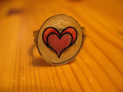
Chalk up another point for having a typewriter around. When I was gathering up the Valentine's Day gifts for my wife yesterday, I came to the sudden realization that the card that I'd picked up weeks earlier was a birthday card, and not for this particular holiday (the curse of having the two dates fairly close together: I tend to handle all the cards and gifts in one trip.) Solution: pull out the Silent Super from the foot of the bed, raid my kids' rooms for scissors and a glue stick, and concoct a last-minute art card, complete with a jagged typewritten heart on the front. It took two tries, as attempt #1 looked more like an actual anatomical heart than the traditional Valentine shape. Add a couple of rubber stamps and a cheesy typewritten ditty, and now her box of candy has a seasonally-appropriate mash note to go with it.

Roses are red
This typewriter is green
This is the most last-minute Valentine
That you've ever seen!

OK, we're not talking poet laureate here, but it sure beats "Happy Birthday."

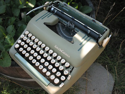
The day was saved by a Smith-Corona Silent-Super.
SC Silent-Super & Strawberries

Saturday, December 10, 2011

Yikes

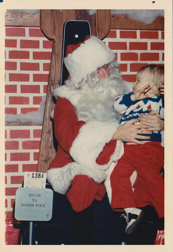
December 10th already? Egad, this month is flying by. Pie-baking and cookie-decorating ruled the day, and on Monday, the promise of meeting the Big Guy Himself. My daughters prepared their letters today before dinner: handwritten, of course. Does St. Nick even have an email address? And how do you know it's not an outsourced elf on the other end?

These are the kinds of things I worry about.

Christmas 1971

Thursday, October 27, 2011

Sweet

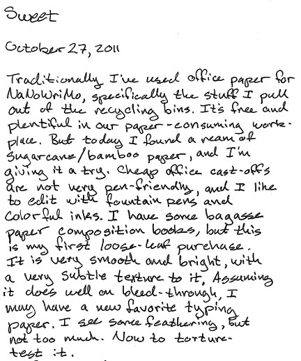
20111027 pencast

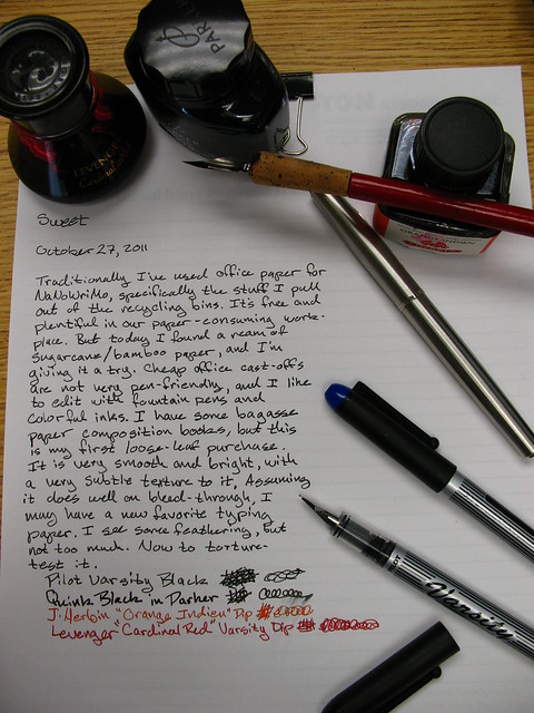
Our scanner at work is black and white only, so here's a photo of my ad hoc test setup. The lines you can see on the paper are shining through from a lined pad I put underneath the sheet.
Bagasse paper stress-test

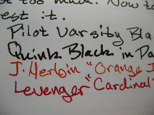
Ink feathering detail:
Bagasse paper feathering

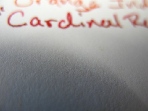
Paper texture detail:
Bagasse paper texture detail

The paper is by Sugarmade, and is acid-free, 20#, 92 brightness.

Wednesday, October 20, 2010

Fussing, and Making Do, and Moving the Hand

Pad, Pens, and Pipes
I'm re-reading Natalie Goldberg's Writing Down the Bones right now, having just wrapped up Chris Baty's No Plot, No Problem. If you've suffered through my endless posts of late, you know that having no plot is not a problem for me: I'm soaking in plot, so to speak. What I'm lacking right now, though, is excitement about the story I have in mind. It's probably pre-NaNo anxiety, so I'm trying to read Inspirational Writing-Type Books that won't necessarily make me love it, but will at least get me to relax about it and just let the words come. But of course I'm happiest when I'm fussing around and fretting and planning and plotting. And as hippy-trippy as Bones can be -- and it is -- Goldberg's mantra of keep your hand moving is a good one, and I'm trying to absorb it (again.)

I'm also fussing about the letters that are sitting on my desk, waiting to be replied to. In fact, I've got two letters from one person, which is throwing me completely off. Our home is in disarray right now thanks to a long-overdue remodeling project, and I'm still enjoying the last week and a half of lunchtime walks before they are sacrificed to NaNo, so my typing time has been reduced to nil. What I need to do, I've decided, is reply to these letters by hand to get past the angsty writing-block stew that I've brewed for myself. And that leads to fussing about stationery. Or finding some that says "middle-aged ordinary guy" not "Hello Kitty obsessed tweener" or worse yet, "Miss Havisham." Short version: there isn't much. Longer version: at least not reasonable for someone that expects to write more than a dozen letters in a year. So, I'm making do.

After some surreptitious testing in the store (ahem) I've picked up a drawing tablet by Canson, pictured above. And I think it will do. As Goldberg reminds us, it is the writing that is important, and I'm simply fussing too much right now to let myself do it. So if you're on the receiving end of one of my letters, you can expect a bit more rambliness than usual -- if you can even tell -- as I practice defussing with a moving hand.

Monday, September 27, 2010

Not Peculiar, But Particlar

I stopped off at the office supply megastore this morning on the way in to work. My wife wisely gave me the job of picking up more notebooks for my son ("Because I know you like shopping there.") If you've ever had the pleasure of trying to get a teenager to write, with actual paper and by hand, you can skip ahead. Otherwise, let's just say that it's a challenge. We're home-schooling my nearly-teen this year, and hit a slightly rough patch when it came to the two-headed whammy of composition assignments and essay questions. Clever one that she is, my wife noticed that the boy preferred writing with gel pens on legal paper. Specifically, glue-top, wide-ruled, no-margin pads in yellow. He balked at the idea of getting paper pre-punched for his three-hole binders, because even those throw a red margin line down the left side of the page, and he hates that. "I feel trapped" with margins, he says.

Fair enough. I'm certainly not one to begrudge him a preferred writing surface or a favorite writing implement. I've certainly spent enough time and spilled enough digital ink here talking, bragging, and giving away my favorites. And I certainly don't think he's being peculiar at all. Just particular. If that helps the words manifest on the page, then so be it.

Friday, August 6, 2010

Notebook Review and Paper Prize-a-Palooza

Six years ago, I gave up a job I'd held in San Francisco, the job that lured me out of the midwest to the palm-and-fog-kissed shores of Northern California. I don't regret the move, or giving up the long commute, or no longer being the un-hippest person in a very hip city. Sometimes, however, I do regret giving up the convenience of working right in the middle of an urban center, where a walk of a few blocks could take me through North Beach, Fisherman's Wharf, and in sight of Alcatraz and the Golden Gate, or (when our offices moved), the bustle of the financial and museum districts. There were two stationery stores that I haunted regularly during my time in the City (always capitalized) but trading that in for a job far closer to my suburban home meant swapping urbane and cool for strip malls and chain stores. (Rest assured, I'm still very much the un-hippest person on my commute.)

This is a long-winded way at getting at today's topic: a review of the Rhodia "Webbie" journal that was graciously arranged by Stephanie of the Rhodia Drive blog, and Karen Doherty of Exaclair, Rhodia's U.S. importer, and who I now envision as an orange-clad Santa Claus. Stephanie asked if I'd be willing to review a blank Webbie here, given that I've whined very publicly about the impossibility of laying hands on one at any of my local retailers. Here in the uncool 'burbs, we can only get hands-on time with Rhodia at Borders Books or Target. The latter focuses on their pad-style products, and the former neglects them almost entirely, in favor of their house-brand journals and a big Tower o' Moleskine. I'll come back to that.

Anyhow, Stephanie offered, Karen hooked me up, and the package showed up yesterday. Here it is:

Rhodia Large Web Notebook ("Webbie")

Pretty, isn't it? Like most of their products, the webbie comes with either a black or orange cover. I happen to like the orange, since it shows up best in the depths of my massively over-packed bag. And the orange is a distinctive Rhodia color: those-in-the-know can spot a Rhodia user from across the room. You can't help it: these suckers are bright.

Technical specs: the webbie comes in two sizes, A5 and A6 if you're keen on the ISO standard paper sizes, or "half page" and "quarter page" if you're not. This is an A5 size, dimensions are 5 1/2" x 8 1/4", and overall thickness of the notebook is about 5/8" closed, with the pocket empty. There are 192 pages inside, divided among six signatures sewn into the binding. The pages will lie flat with a little encouragement at first: work through the pages from both ends and run a finger along the spine to spread them out a bit. The binding is loose enough that you can write very far into the fold without problems.

Pages lie flat in a Rhodia web notebook ("webbie")

Rhodia appears to be positioning themselves against Moleskine here, as the webbie sports the same general features list: sewn signatures, attached ribbon bookmark, expanding pocket on the inside back cover, elastic closure. Unlike Moleskine and Rhodia's own line of pads, the covers of a webbie are a cushioned material around a stiff center. Their web site says this is "Italian leatherette," though to my hand it feels slightly rubbery: not unpleasantly so, just slightly squishy and padded. It's stiffer than the oilcloth cover of a Moleskine, and provides enough firmness that you can write without a surface behind it in a pinch. I tried writing on it while sitting in a variety of postures -- including sitting up in bed -- and it was comfortable to hold.

Binding, bookmark, pocket, cover: parts of a Rhodia web notebook ("webbie")

Also unlike Moleskine, the webbie uses Clairefontaine paper, which is French-made by a gaggle of delicate cream-skinned maidens. I'm not quite sure about that last fact, but I do know that Clairefontaine paper is famed for its fountain-pen friendliness. It is wonderfully smooth paper, and takes ink without feathering or bleeding through to the opposite side, and with minimal show-through. The webbie product has undergone some revisions as the first production runs did not use a pen-friendly paper. Stephanie posted details about this, and I'm pleased to say that the revisions were worth it. The paper may appear white in these photos, but it is actually a light cream color. This might matter if you're an artist or artistically inclined and want a true white background. As a writing notebook, the color of the paper is fine.

Testing the pen-friendliness of a Rhodia large webbie

Torture-testing the paper in a Rhodia web notebook ("webbie")

The webbie withstood my "new notebook torture test" with flying colors (ha! ink pun.) If you cannot read my scrawls, I hit the page with:
  • An extra-fine steel-nibbed pen inked with Parker Quink black. EF nibs can catch and snag on paper.
  • A Parker Latitude fountain pen (the silver one pictured above), also inked with Quink. This has a particularly wet nib and is my firehose of ink. It makes note cards weep.
  • A Levenger True-Writer inked with Levenger "Bahama Blue," which I am currently using on my brain-dump notebook for NaNoWriMo. Levenger inks are pretty dye-heavy, and I can see bright colors showing through paper better than dark ones.
  • Some "generic" writing instruments: a #2 pencil, a "hard"-lead pencil, a couple of ballpoints in different colors, a wax crayon, a magic marker and colored pencils from my daughter's art kit.
  • Three Sharpie markers: the regular sized one ("fine" if you believe that), an extra-fine one, and a super-wide one, meant for yard sale signs and the like.
  • I also hit the page with some soak-through tests: drawing dense crosshatches and scribbles in one place, going back over sections later with a pen, and using a cotton swab to paint a section of the page.
The paper is thin enough that some of the writing will show through to the opposite side, but I don't think it's bad enough to worry about. More notable is the amount of ink that does not show through, including the swab test and my dense scribbles. Those are barely discernible. The only issues I had were:
  • The hard lead pencil is faint against the cream colored paper. I suspect the paper is too smooth to really give the lead enough friction. The #2 pencil shows up fine.
  • The Sharpies soaked through, especially the super-wide one. The extra-fine one did bleed in spots, so if you like to use these for writing or drawing, you may require a heavier paper.
  • The paper puckered slightly when it was particularly wet -- for the swab test, for instance -- but it smoothed out upon drying.
  • I was bitten by drying time for some pens. There is a small amount of wait for ink to fully dry on the paper, and if you're the impatient type, eager to play with a new notebook (me, in other words), you'll find that some of the ink transfers to the adjacent page. You can see some ink spots on the orange end-paper in the photos. Some folks carry a couple of sheets of blotter paper in their journals to slip between fresh-written pages. It's something to consider if you're using a fountain pen.
Show-through on the paper of a Rhodia web notebook ("webbie")
Some show-through on the paper, but it's not distracting

Bleed-through
Sharpie was the only pen I could get to bleed through

Allow some drying time: Rhodia web notebook ("webbie")
Allow some drying time, unless you like Rorschach blobs

Otherwise, the Clairefontaine paper held up like a champ. I've heard of paper issues with Moleskine notebooks, and never being one to stop a juicy rumor, I'll repeat it here. As I understand it, they have different suppliers for different size notebooks, and some pen aficionados are upset about this (rightfully, IMHO.) If you're going to drop your hard-earned on a snazzy notebook, you should be assured that it's not going to feather all over the place. The performance of the paper in the webbie is on par with the performance of the Rhodia pads, of which I'm a vocal fan. And availability online is quite good, even if your local options are limited.


Entries are closed, I'll post winners in a new topic.

And if your local options are limited, then let me introduce you to the first-ever Clickthing Paper Prize-a-Palooza, or Stop Me From Showing Up On That "Hoarders" Show. Part of the deal for getting my hands on a review notebook is that I would also receive a second notebook to give away. And let me tell you, this is a tough thing to do, since I am a mean, selfish person. But the spirit of Exaclair Goodness is upon me today (are you paying attention, Karen?) and so I'm giving to you, lucky reader, the chance to win a Webbie of your very own. Covet it. Write in it. Name it George. All you need to do is leave a single, non-spam comment on this post, perhaps raving about your love of paper products, or how great you think free stuff in the mail is, or how great I am, or all of the above. At some point in the future, I will count the comments and run them past the magic robot at random.org to pick a lucky winner of a twin webbie to my own. This one, in fact:

Prize #1
Ooooh!

If this doesn't sway your heart to the Power of the Orange, then you are a cold, dark person. But I don't judge. And because I'm simply suffused with the power of good right now, I'm also clearing the shelves and handing out these additional prizes, for folks who don't win the webbie...

Second Prize: a pair of leather-covered "M" journals from Staples. A5 size, lined paper with a classy gilt edge. Pay no attention to the Clearance stickers on the paper band. These would make really nice gifts, which is what I thought when I bought them, and then realized that all my gift-receiving people are heathens and slobs who don't deserve nice things. But you do.
Prize #2
Aaaah!

Third Prize: a trio of Canson 4x6" hardbound notebooks. I keep one of these around for testing new pens and inks, but I don't need all of them. One has a small nick on the spine (not shown in picture.)

Prize #3
Hmmmm!

Consolation Prize: four boxes of Southworth "Fine Granite Note Paper" in ivory, each piece is 5"x5", and there are 275 sheets per box, so, um, a lot of note paper. You will never want for note paper again. Ever.

Prize #4
Huh?

Yes, that's right. I like the Clearance racks. But now you can too. Just leave a single, non-spam comment below and you'll be entered for the drawing, to happen as soon as I feel like there's enough comments to make it worthwhile or I get tired of looking at all this stuff on my desk. I will announce the drawing before it takes place, and will contact winners by email. Please make sure I can do this through your comment.
I will pick a bunch of winners, and the first one I can get in touch with gets the webbie, then the second gets the pair of journals, the third gets the mini notebooks, and the fourth gets a big honking box full of notepaper.

You will need to pass your mailing address to me in private if you win, so please be prepared for this. I will ship reasonably, but cheaply, especially if you live somewhere really expensive to get to, like Mars.

OK, you made it to the bottom. Go forth and comment!

Thursday, May 6, 2010

That's What She Said (Wrote)

Brainstorming supplies

I don't know whether this is one of those freaky typosphere convergences, or another tribute to the utility of paper and pens, but today's post on Little Flower Petals was spookily similar to what's become my own standard practice: namely, using a composition book to jot down all manner of ideas. I've talked about this before, in using a small Rhodia pad for on-the-go capture, and I still tote that little guy around with me on walks and to the kids' sporting events, as it's the ideal form of pocketable pen-friendly paper. But lately, I've been using a composition book by the bed, and trying to make myself write at least one thing in it every night.

Composition books are great: they're cheap and spacious and a comfortable lap size, and the stiff covers are suitable for holding a reading light: good for those of us jotting late at night. I'm using Staples "eco easy" line of books, which are made from bagasse paper (remnants from sugarcane production.) It's a light, slightly crispy paper that also takes fountain pen ink exceptionally well, especially for the price. My barely-awake ramblings in the notebook get transferred to index cards on one of the typewriters: usually Norma Jean as she's an elite machine, so I can pack more words per card as needed.

I have a number of works-in-progress in mind when I make notes, and put an abbreviated working title next to the notes which gets transcribed onto the cards (makes it easier to sort out later.) Currently, I've got nine works in various states of woolgathering, including my 2009 entry, and a first draft that I started writing just to test out a restored typewriter (and which will need a do-over, since I got stuck and abandoned it.)

With all the hype about the latest greatest iThing and how it will revolutionize media consumption, it's very satisfying to find rewards in low-tech acts of media production.

Tuesday, March 3, 2009

Lebbeus Woods on notebooks

I've got a typecast formulating in my mind for later, and by magical coincidence I just read a complimentary post by one of my favorite contemporary architects, Lebbeus Woods. I am lucky enough to own a copy of The New City, which to me reads like an archaeological study of a decaying city of the future. His work is eerie and precise, and just hits all the right notes for me, even if I can't always make sense of his essays.

I mentioned him before in my list of 25 things (see #24) in no small part because his drawings tend to be done in pencil, and have a hazy, almost photo-real quality to them. In his blog he talks about his use of notebooks as a means for capturing ideas while being limited to the modest space of an airline seat:
Notebooks are portable. They can be kept secret, or published. Technically, they are simple to make. Pen and paper. The hand, eye, and thought. Freed from any sort of burdensome apparatus, thought becomes more agile in confronting itself.