Wednesday, February 22, 2012

An Author is Me

Kyras-Camera-High-Dive 061
"Kyras-Camera-High-Dive 061" by flickr user JoshSchulz


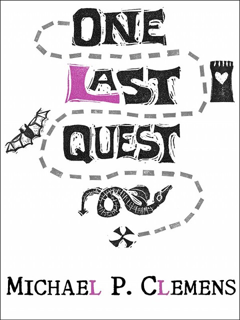
I spent the holiday weekend making a mess on our dining room table, and after much tweaking and pixel-pushing and fishing around for compliments, I pulled the trigger: One Last Quest is purchasable, at least electronically. That's one small step for (a) man, one more leap for the Typosphere. (Just following in Mr. Speegle's footsteps, here.) Now I sit back and recoil in horror at all the typos that slid by undetected.

One Last Quest ebook cover art
Click me for a more humorous tomorrow


Can't sit for long, though. I'm already reading through the formatting guide to upload directly to Amazon and Barnes & Noble. Formatting for Smashwords is very particular, and I hope that I can use the same file -- or a slightly tweaked version -- to handle the other two sites. And then I need to figure out if I'm going to resurrect the print version that I proofed oh-so-long ago.

The only scary part is the jump...

Sunday, February 19, 2012

Cover Art Again: Mad Science Sunday

When last we left our intrepid self-publisher, I was trying to figure out how one might find an illustrator for one's book, and then received a lot of Excellent Advice from Rob Bowker, plus a swarm of email from very talented people. So, you say, what's happened since then?

Nothing! I say. Well, not quite nothing. I had an idea and a vision but lack the skills to make those a reality,  and then I found someone willing to try to combine the three, and then schedules and Real Life intervened in both our lives, and the whole thing went fizzle. You might remember this book from the hastily assembled default cover that I slapped up in CreateSpace:

Time to Edit, or, the Proof is in the Pruning

Yeah, I don't like it either, but I was short on time and talent, and that's the best I could do.


OK, now let's jump into some mad science. I've dabbled in carving rubber stamps from erasers -- though I can't find any reference to it on the blog -- and when I was a better pen pal, I'd thwock a couple impressions on the envelopes or the letter. The erasers come from the dollar store, and are cheaper and a lot more disposable than a piece of linoleum if I make a goof.

A few days ago I got the brilliant-in-my-own-mind idea to get a cheap picture frame to hold a number of these stamps together to either allow me to combine them an make a large stamp area, or to let me re-arrange them and do some sort of modular design. As I started playing around with the idea of multiple stamps, and laying them on top of each other, and cover art, and...

Wait a minute!

Cover Art: The Carvening

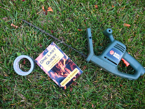
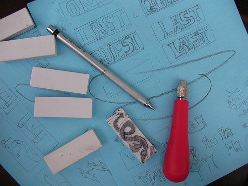
That red thing is the Speedball lino-carving set; the blades store in the handle. I started noodling around with a dragon stamp which you can see, and I'm sketching out the stamps for the rest of the cover. I've decided that this will be a hybrid stamp-and-scanner operation, but I'm pretty excited. I plan to carve out the titles today. Stay tuned.


UPDATE:

This is your brain on a lot of carving. Oof. I think the bulk of it is done. Tomorrow, I work on getting clean impressions and a good scan, and then off to digital cleanup.

The Carveningination: Aftermath

Tuesday, February 14, 2012

Rescue Me

All Heart

Chalk up another point for having a typewriter around. When I was gathering up the Valentine's Day gifts for my wife yesterday, I came to the sudden realization that the card that I'd picked up weeks earlier was a birthday card, and not for this particular holiday (the curse of having the two dates fairly close together: I tend to handle all the cards and gifts in one trip.) Solution: pull out the Silent Super from the foot of the bed, raid my kids' rooms for scissors and a glue stick, and concoct a last-minute art card, complete with a jagged typewritten heart on the front. It took two tries, as attempt #1 looked more like an actual anatomical heart than the traditional Valentine shape. Add a couple of rubber stamps and a cheesy typewritten ditty, and now her box of candy has a seasonally-appropriate mash note to go with it.

Roses are red
This typewriter is green
This is the most last-minute Valentine
That you've ever seen!

OK, we're not talking poet laureate here, but it sure beats "Happy Birthday."

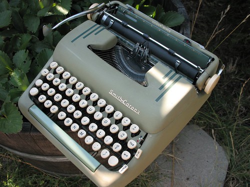
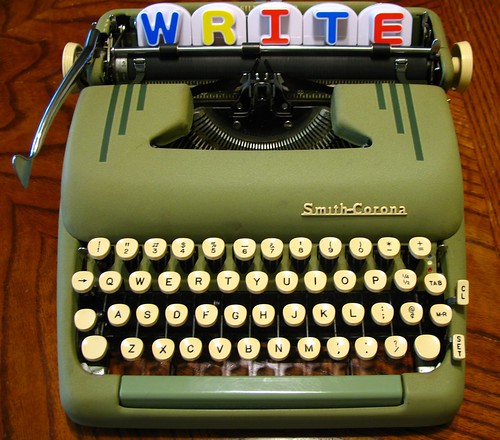
The day was saved by a Smith-Corona Silent-Super.
SC Silent-Super & Strawberries

Friday, January 27, 2012

A Tale of Two Hangers

So, I hate wire clothes hangers. Not in the extreme sense, but I still dislike them because they are disastrous to my shirts. I'm a pretty big guy with broad shoulders, and using cheapo hangers on my shirts makes them pucker up into most-unmanly "shoulder nipples" of fabric. (And hello to all those random Googlers who were looking for something else when they typed "shoulder nipples" into the search box. Sorry to disappoint you. Also: ick.) We've been able to banish all but a few of these from our home, leaving a couple for kid's art projects or for snagging hand towels that fall behind the dryer.

Tubular plastic hangers are only slightly better in that they don't crumple under the weight of normal adult clothing, but they are used mainly for hanging up damp swimsuits in the shower in the summer. Slowly, over the years, I've been replacing both of these organizational abominations with wooden hangers. They're more solid, they are shaped like clothes are actually shaped, and keep my shirts neat. So of course I was delighted when my local thrift store put out a big bin of FREE HANGER'S (sic) TAKE ALL YOU WANT

Oh yes. Yes I will.

So I loaded up. A bunch from Ikea, to join the bunches from Ikea already holding up our coats at home. A few more that were in good shape and looked pretty sturdy. And then, down at the bottom of the bin, I found these two fellows.
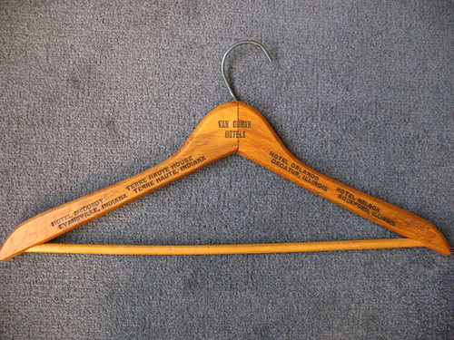

Wooden hanger from Van Orman Hotels in Indiana and Illinois

This one caught my eye first, because it has printing stamped into both the front and back. This is the front, pictured above, and here's a detail from the back:
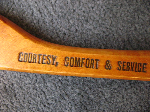
Detail from wooden hanger from Van Orman Hotels in Indiana and Illinois

The full statement on the back is "Four Modern Hotels of Courtesy, Comfort & Service." And when this hanger was in regular use, I'm sure that was the case. Check out the modernity!
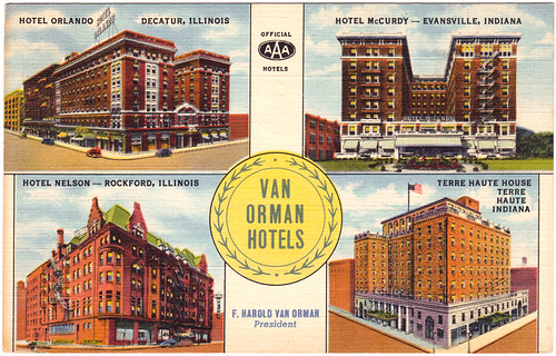
20120127 postcard
Image from Postcard Ranch

I have no idea how this (pilfered?) hanger from a Midwestern, mid-century hotel quartet wound up in Northern California, though I know an estate sale just unloaded a number of items in this shop, so it's likely that the former owner has passed on, leaving this memento of a comfortable stay in one of these fine AAA hotels. What caught my eye the most, though, was that I was born in the selfsame city as one of these four (information thieves, take note.) It appears to still live on today as apartments.

The other hanger was underneath the first: a much thinner, cheaper, giveaway-quality example.

Vintage Coast Tailors and Cleaners Hanger

What made this interesting to me is that I know it's from San Francisco (Vicente St.) and it's relatively old, given the phone number "MO 5662" -- predating the three-digit dialing prefix. Sure enough, Google found a scan of a 1938 phone book with this business and their number, practically dwarfed on a page full of cleaners and a competitor's massive advertisement.
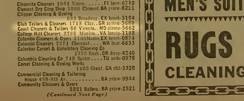
Section from a 1938 San Francisco phonebook
Source PDF document found here

It's not easy to tell what's there now: redevelopment happened, and Google Maps' best guess is that the cleaners address is now home to either a Starbucks or a Chase Bank.


View Larger Map

I have no way to know if these two items came from the same closet, if their former owner had, at one point in his life, made that same strange journey that I have, blowing West like a seed on a contrary jet stream. I know there's no significance to me finding them together, but it made me think of this story, made me do a little searching about two places that I have temporarily called home, and most importantly, saved me from the social shame of shoulder nipples.